Role
UX Researcher & Designer
Timeline
September 2024 - April 2025
Team
1 Project Manager, 4 UX Researcher & Designers
Background
Business Context
Bridgestone is the world’s second largest tire and rubber manufacturer, providing tires to consumers through direct sales and divisions like Firestone. Known for their excellent quality, many businesses reliant on transport choose Bridgestone for their needs.
With road safety being of paramount importance, and significant regulations surrounding business vehicle standards, fleet managers and service providers are faced with the challenges of efficiently monitoring tire health across large fleets. Decentralized data, lack of intuitive visualizations, and inconsistent alert mechanisms compound this difficulty.
These inefficiencies hinder proactive maintenance, leading to increased downtime, safety risks, and operational costs.
Bridgestone has developed a range of tire health management (THM) solutions for fleets and service providers across multiple platforms.

© Bridgestone Corporation. Retrieved from commercial.bridgestone.com
Bridgestone THM Software Suite







Project Objective
Evaluate and benchmark Bridgestone’s tools user experiences against similar, competitive, and adjacent solutions in the market in order to create a product that brings together all of the features users need to achieve their goal of improving fleet efficiency through:
Scheduling and performing maintenance
Tracking tire health across the fleet
Preventing unplanned downtime
Ensuring regulatory compliance
Research
Existing Tools
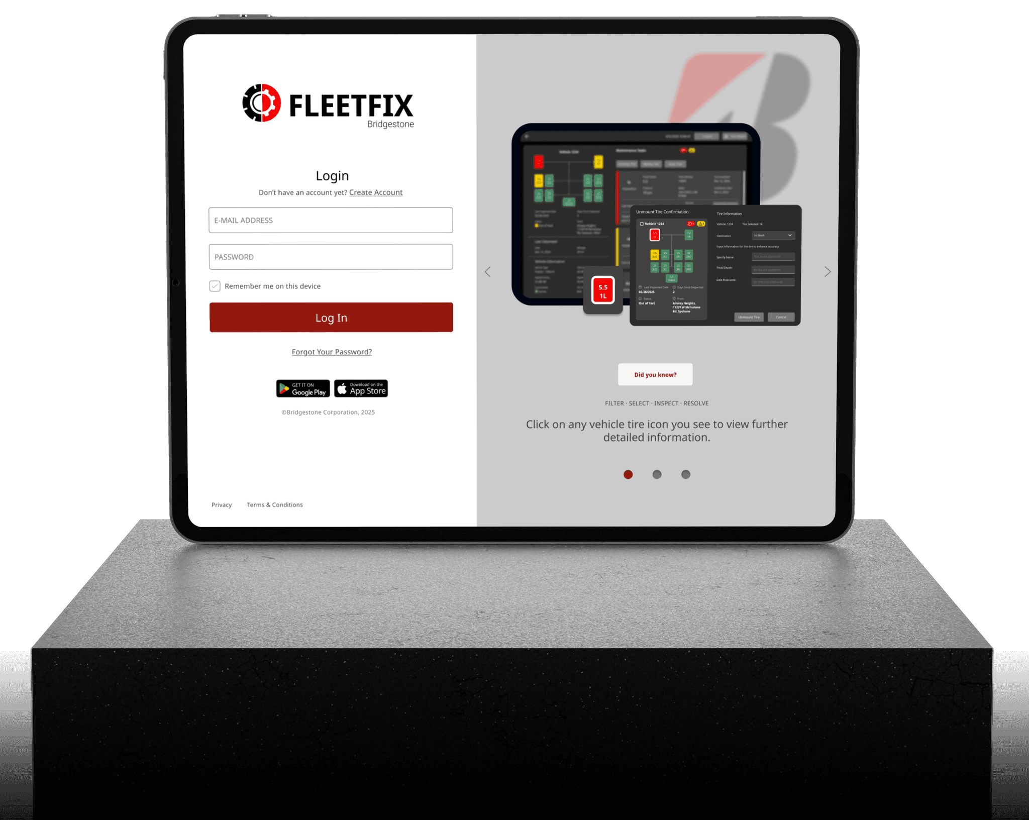
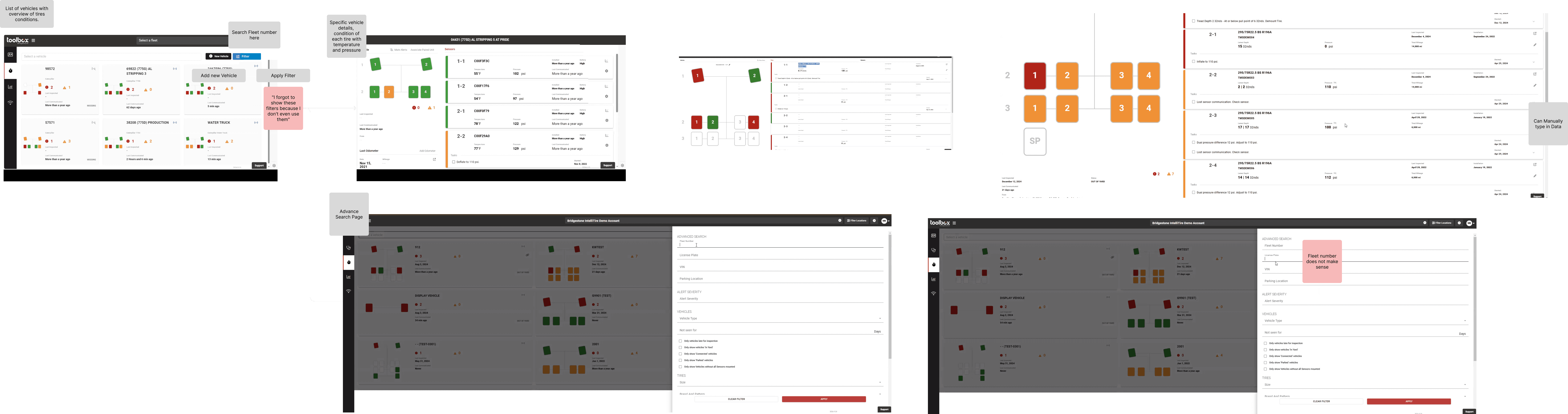
Our team began by familiarizing ourselves with Bridgestone’s suite, gaining in depth explanations from SMEs who worked directly on the tools. We were granted access to test accounts, and catalogued the core interactions of the primary platform we’d be working on, Toolbox.
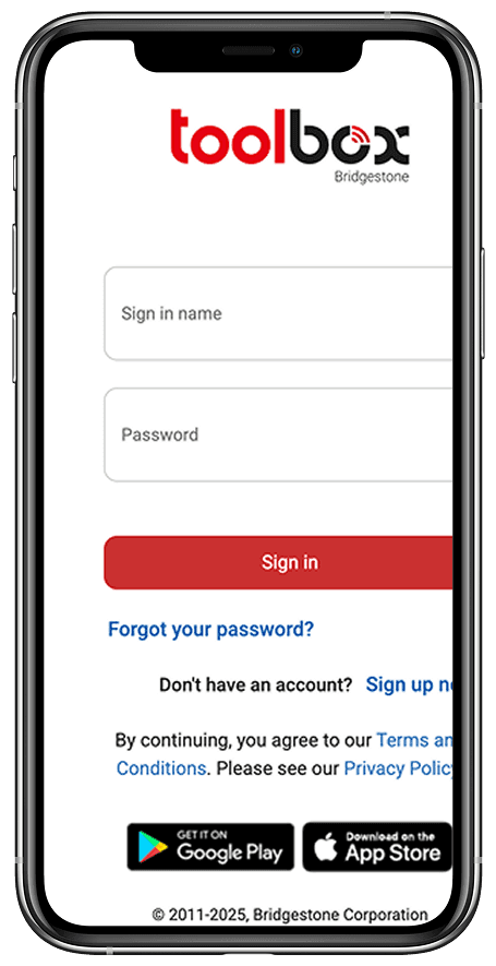
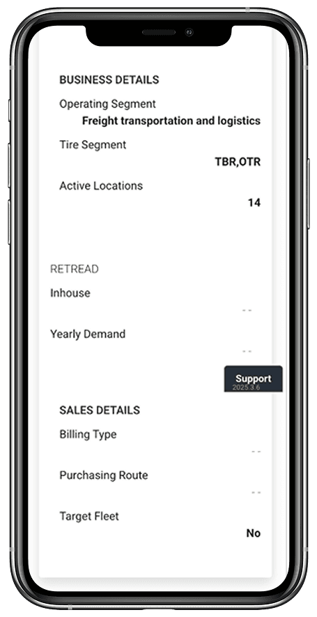
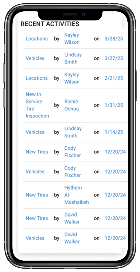
Unusable Mobile Version
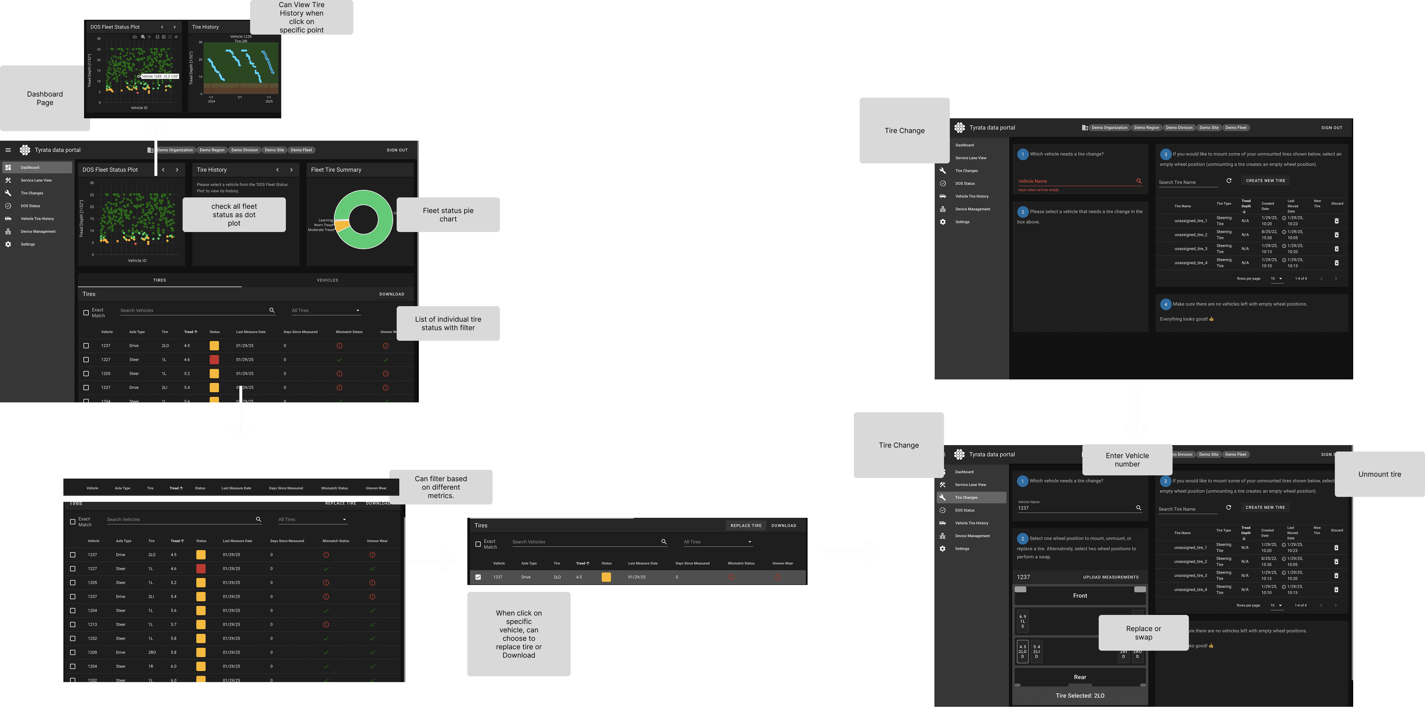
Competitors
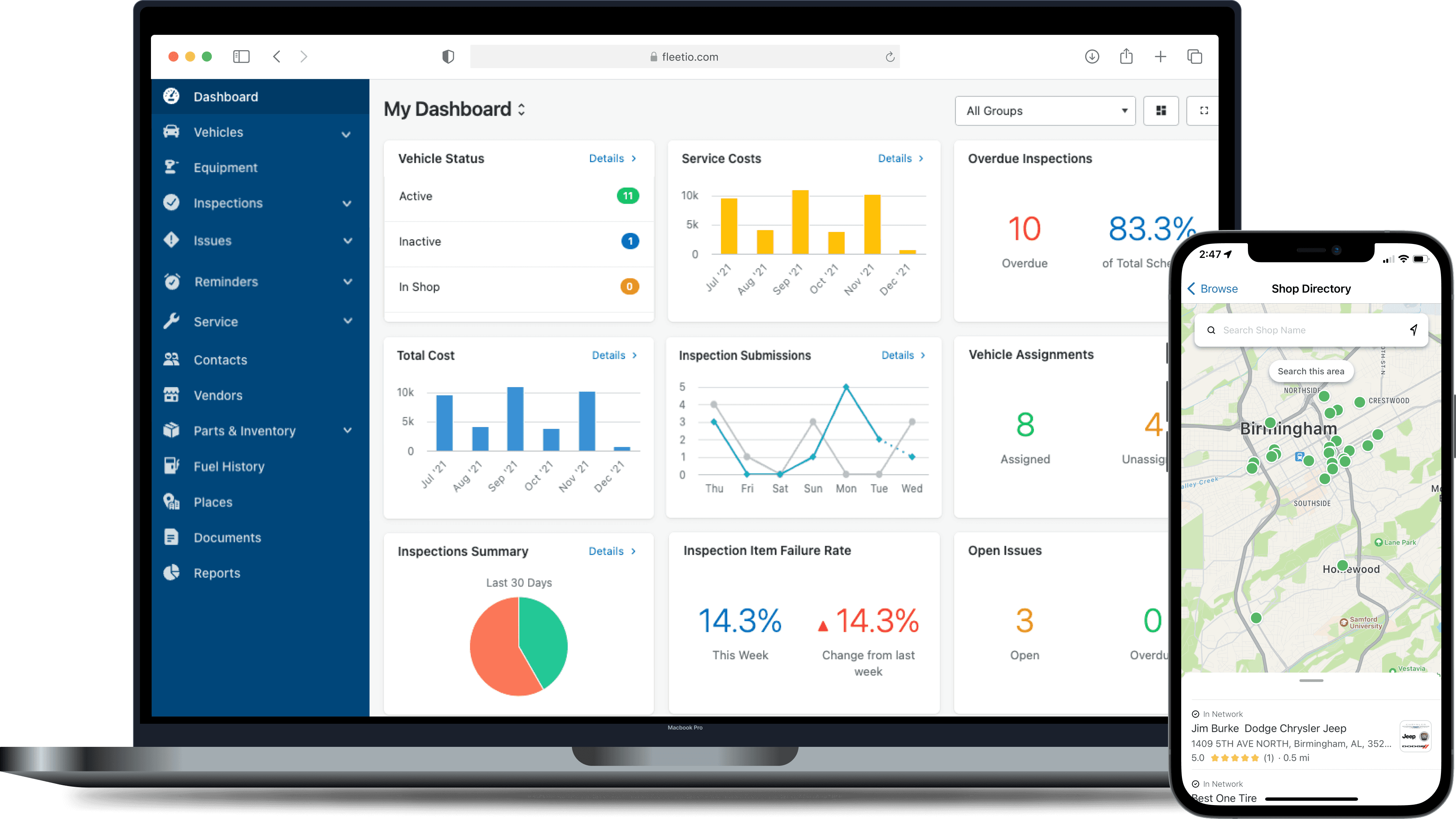
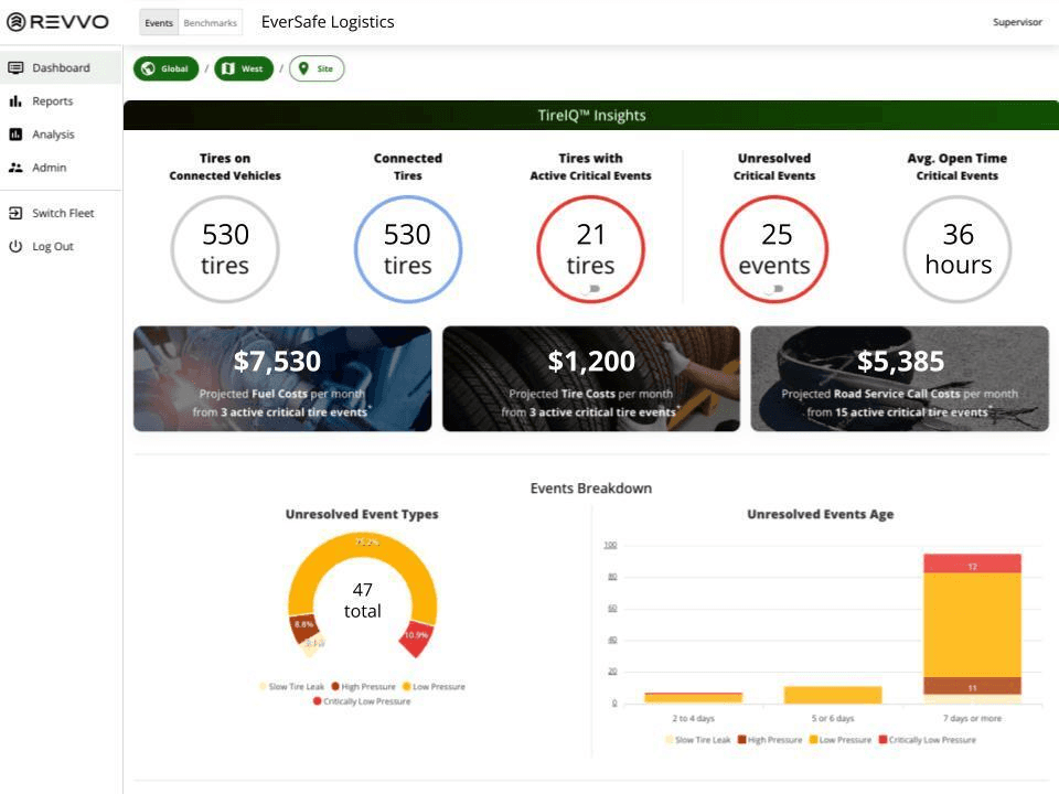
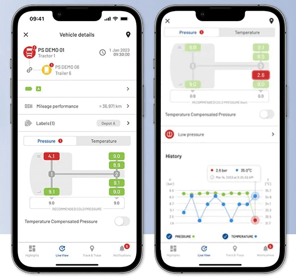
One of the core business objectives of this project was to benchmark Bridgestone’s own tools against competitors. Our team compared other key market players like Michelin and Goodyear, as well as growing startups in the space.
Speaking to Users
After gaining an understanding of the marketspace and service objectives, we identified stakeholders and began interviewing those directly impacted. We spoke to 7 fleet managers of varying fleet sizes, 3 garage managers, and 4 technicians.
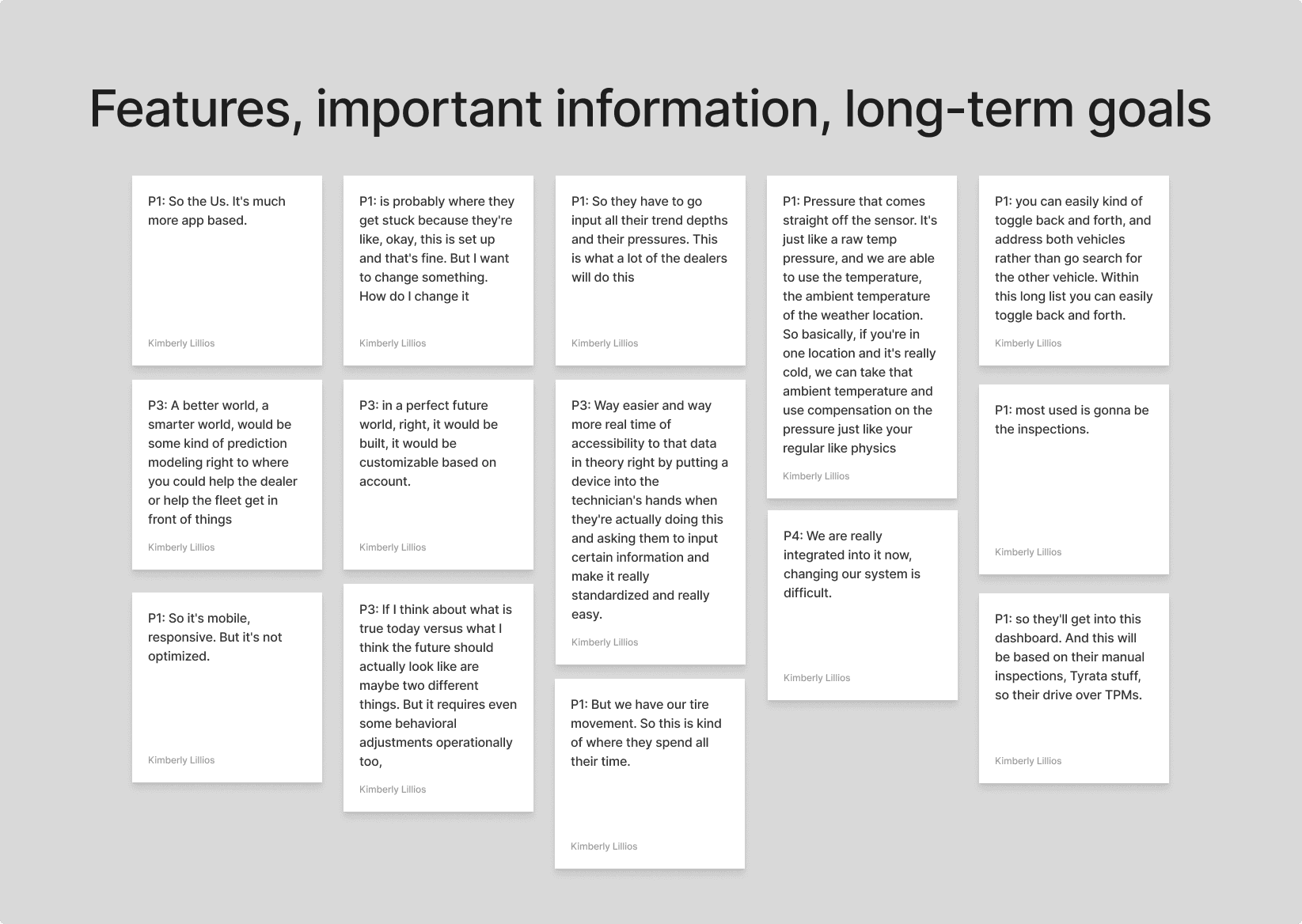
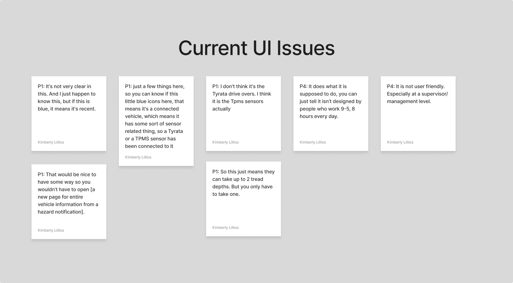
“I know what tools I want to use, but I can’t find them”
Current Bridgestone User
Insights
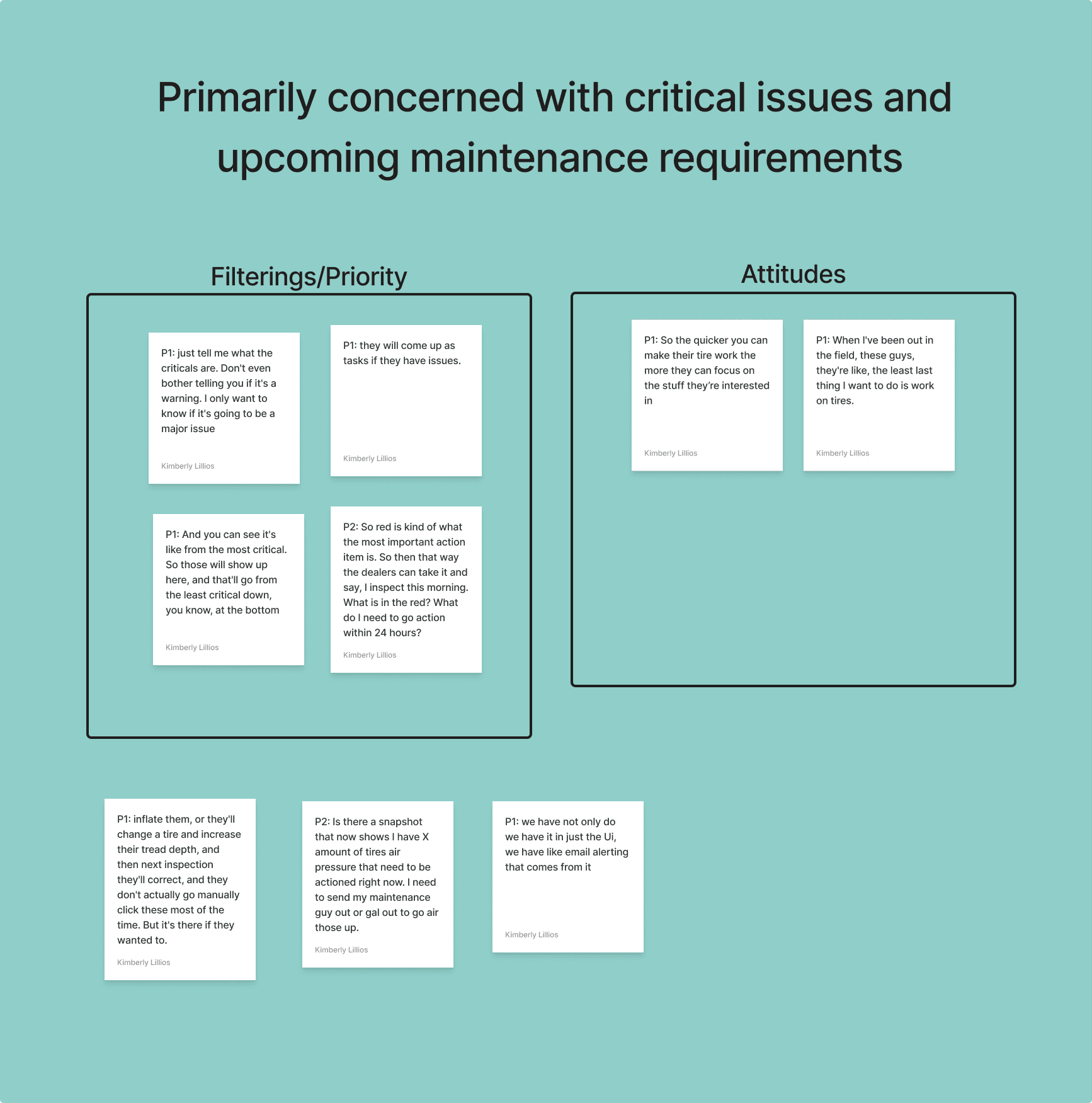
Fleet managers and dealers are primarily concerned with critical issues and upcoming maintenance requirements.
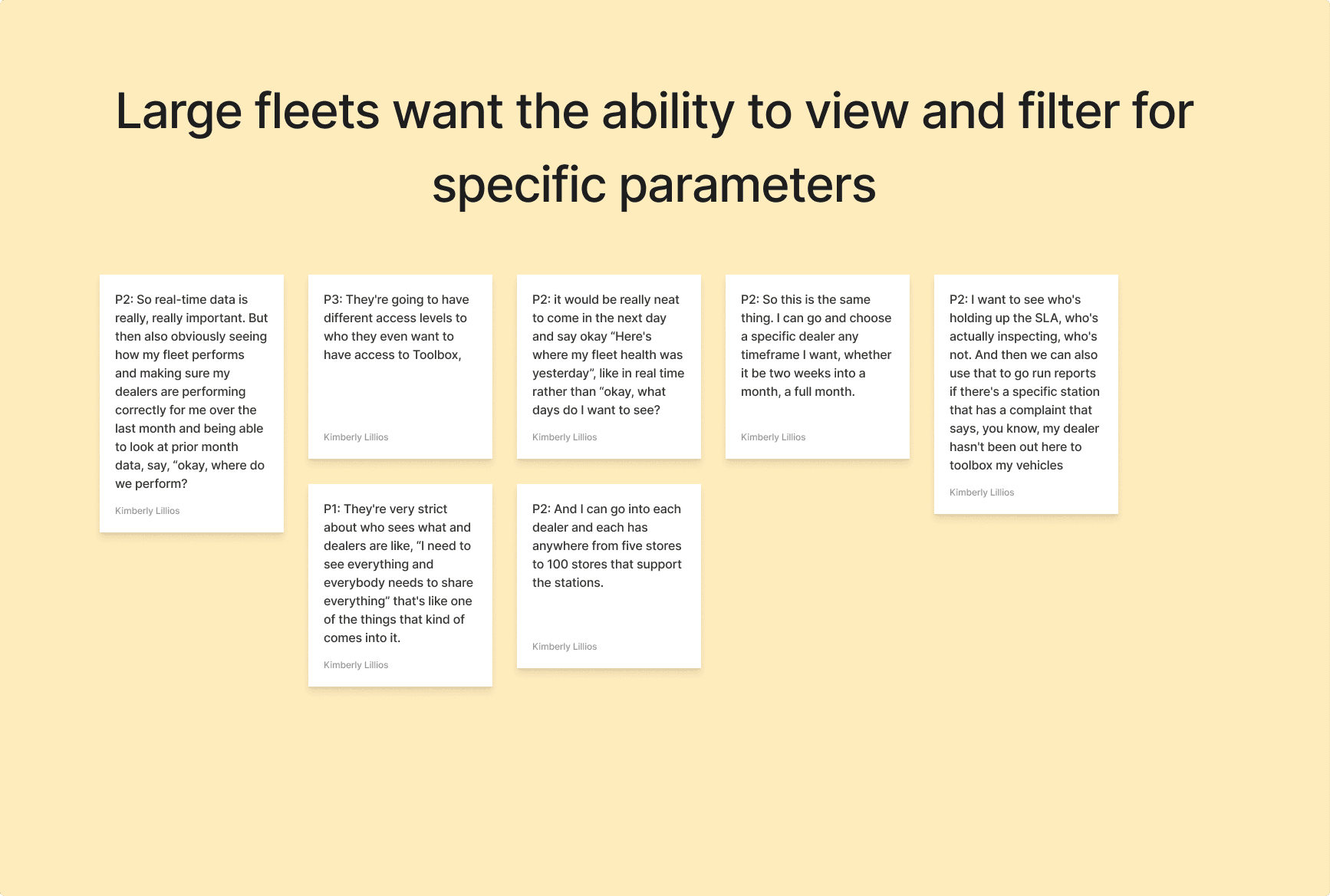
Users managing large fleets want the ability to filter and view for specific locations, subgroups, partners, and individual vehicles.
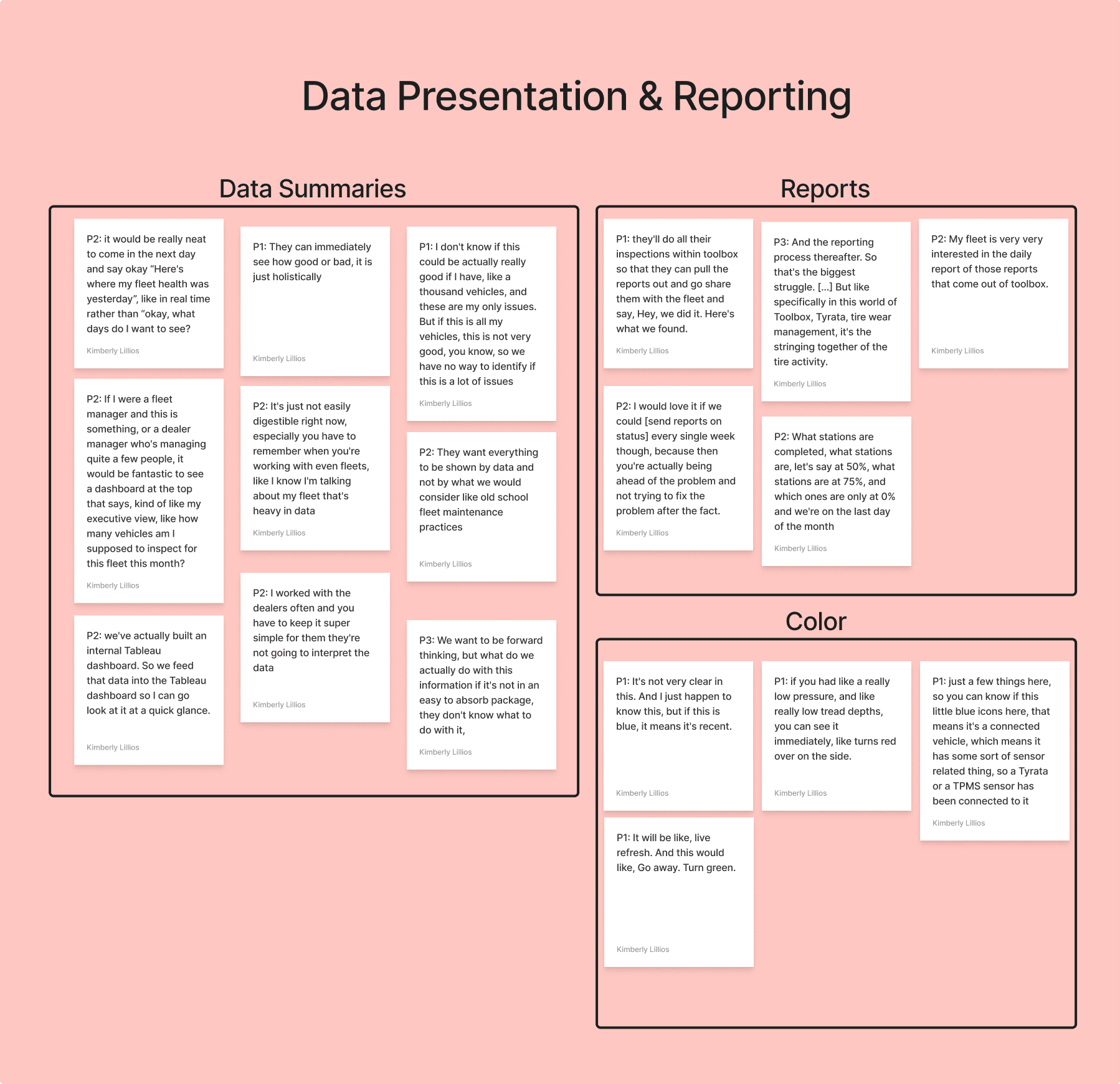
Users need clear, concise data visualizations that are still useful to people with time constraints and limited technical familiarity.
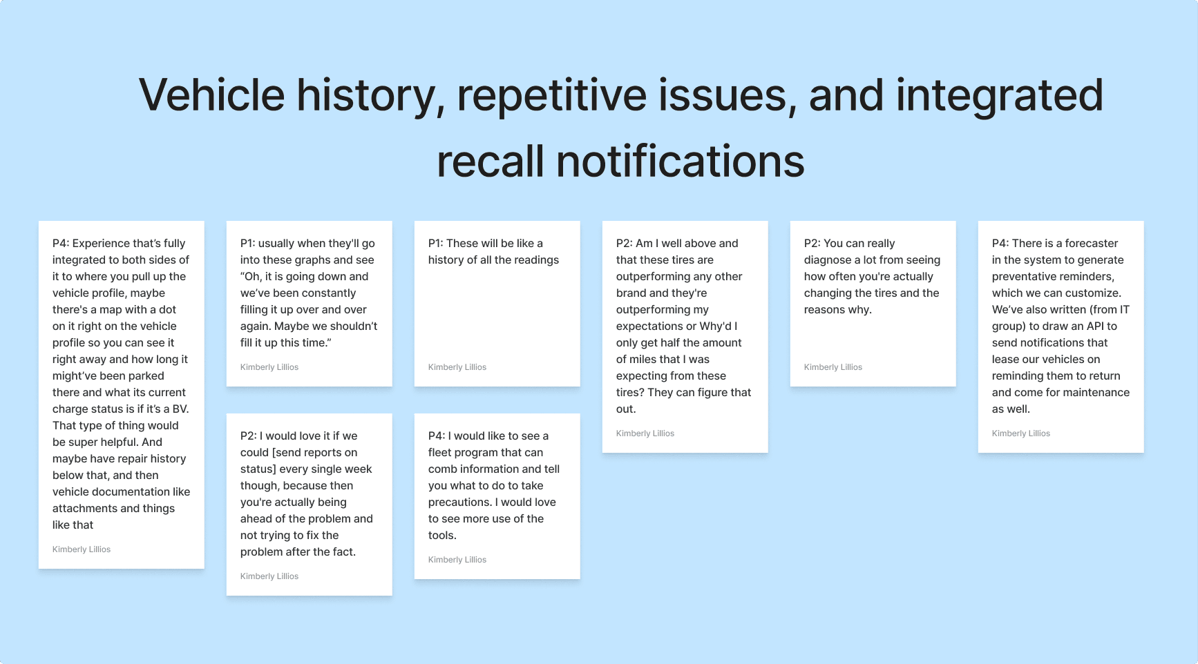
Users want to be aware of vehicle history, repetitive issues, and recall notifications.
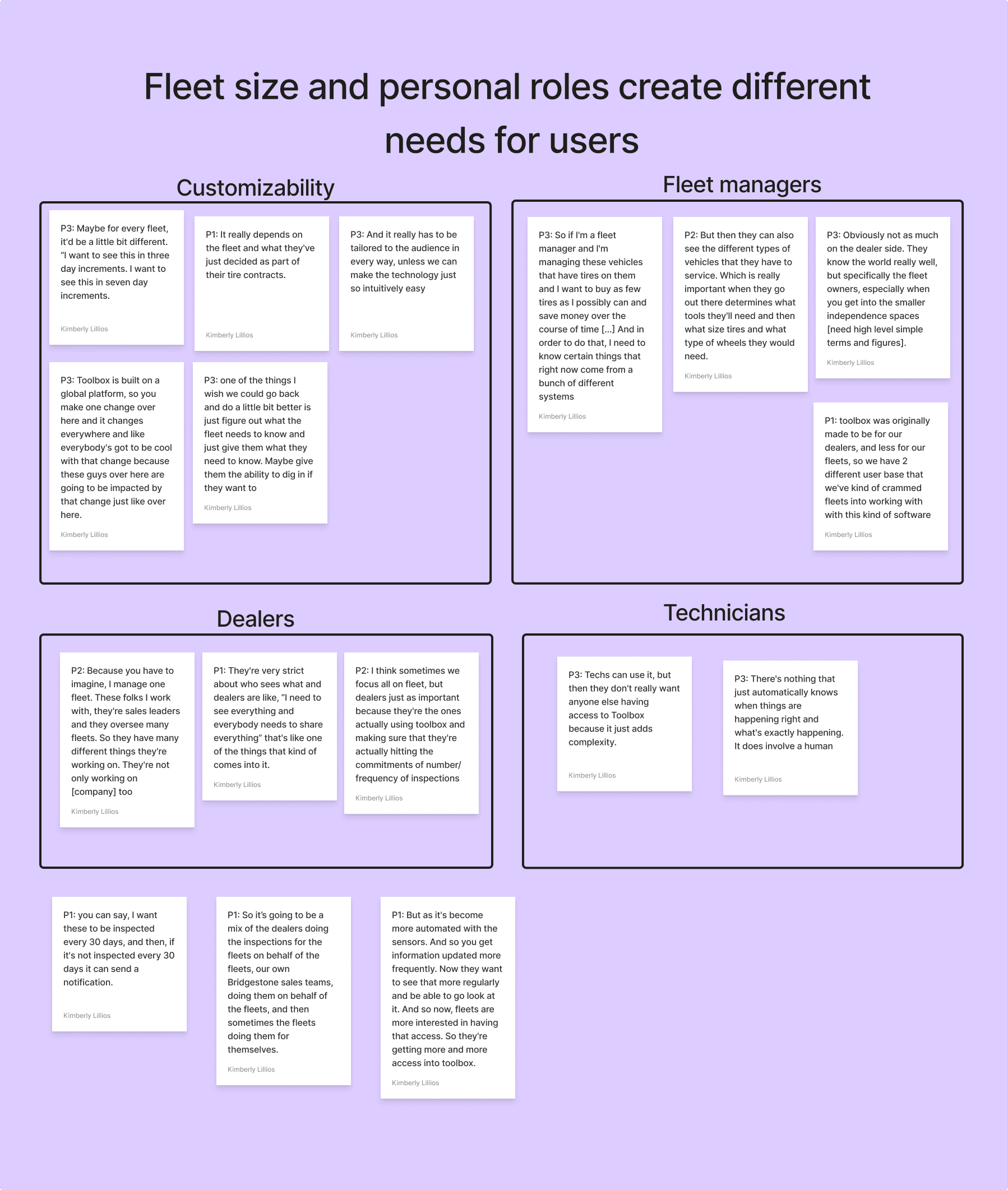
Fleet size and personal roles create different needs for users.
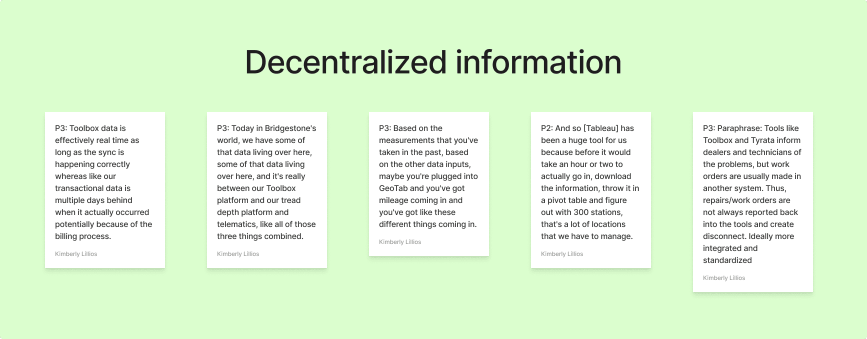
Siloed data creates barriers to access and reporting.
User Representation
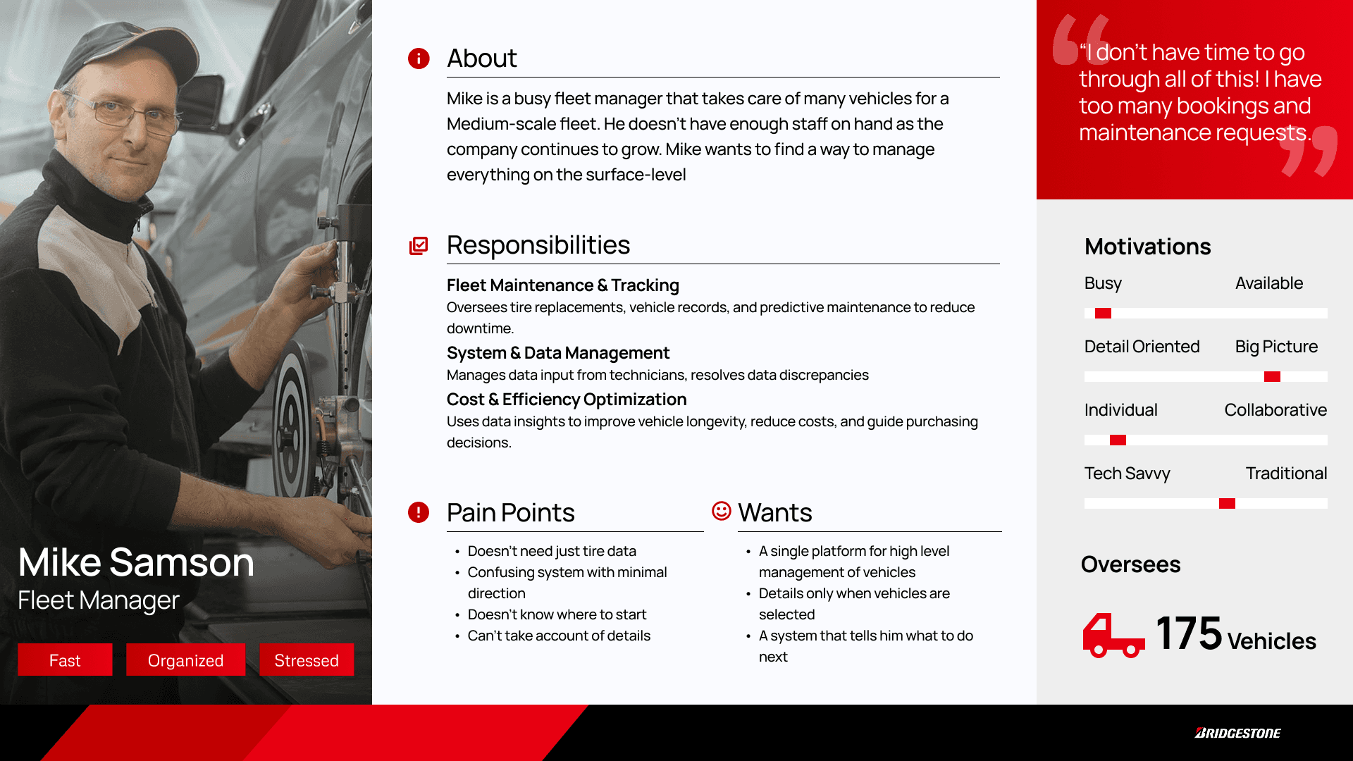
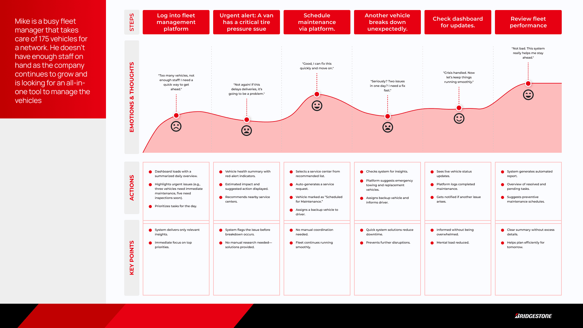
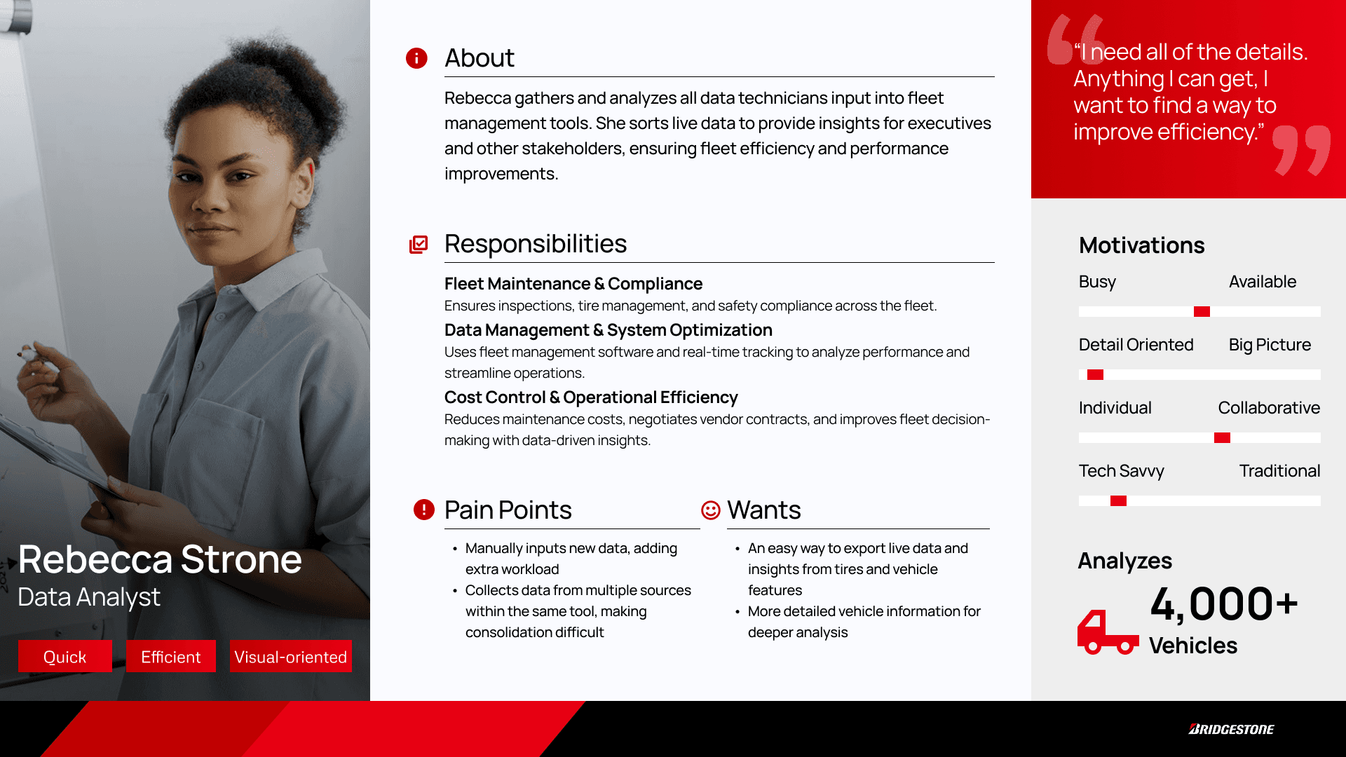
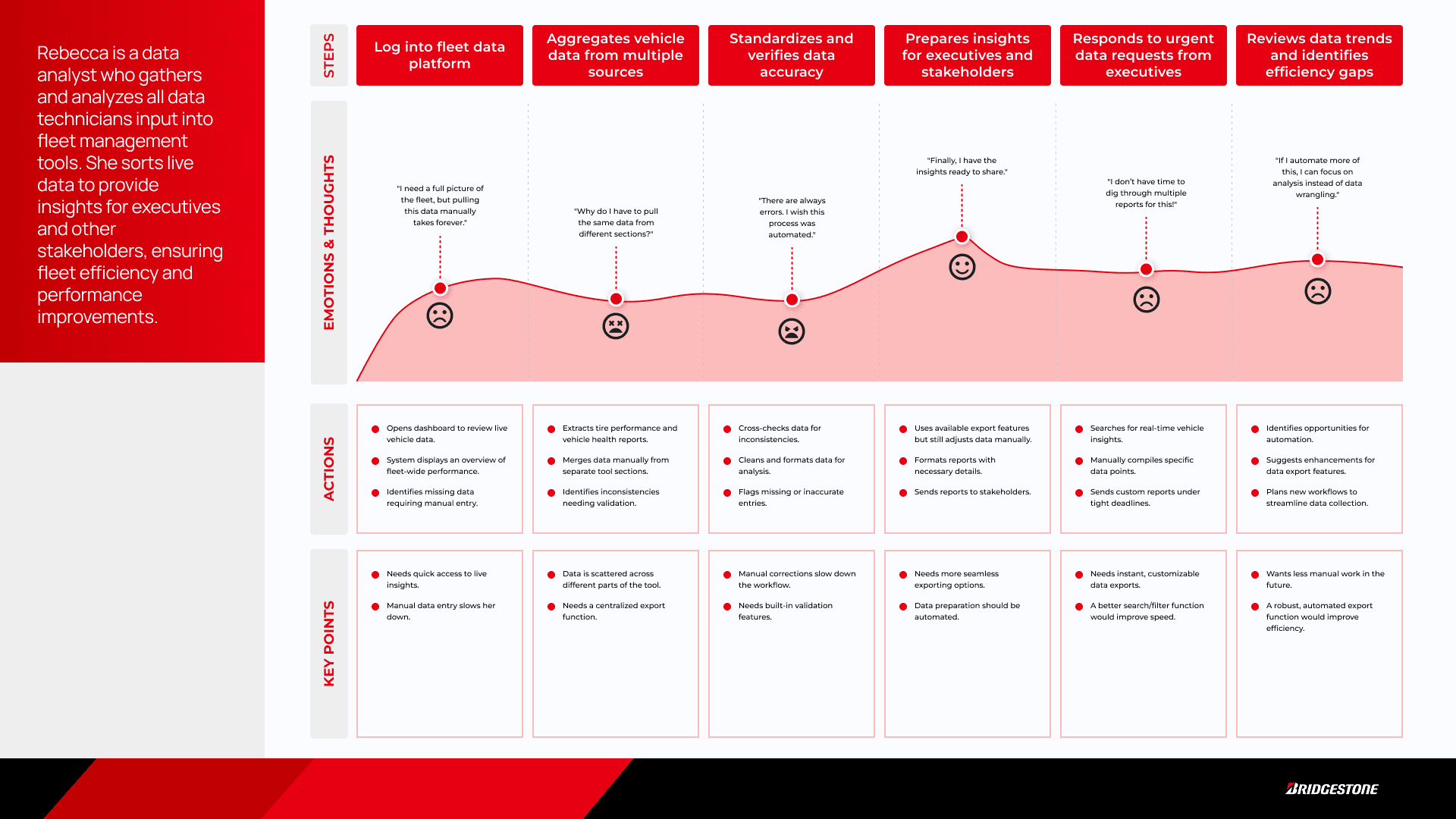
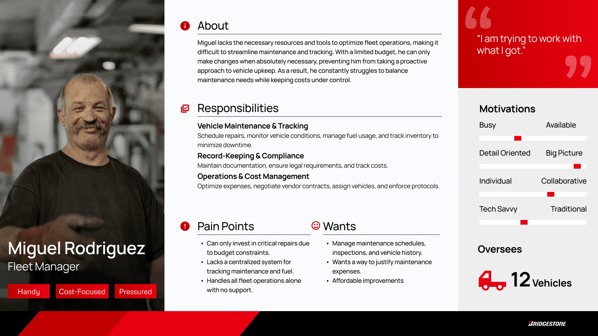
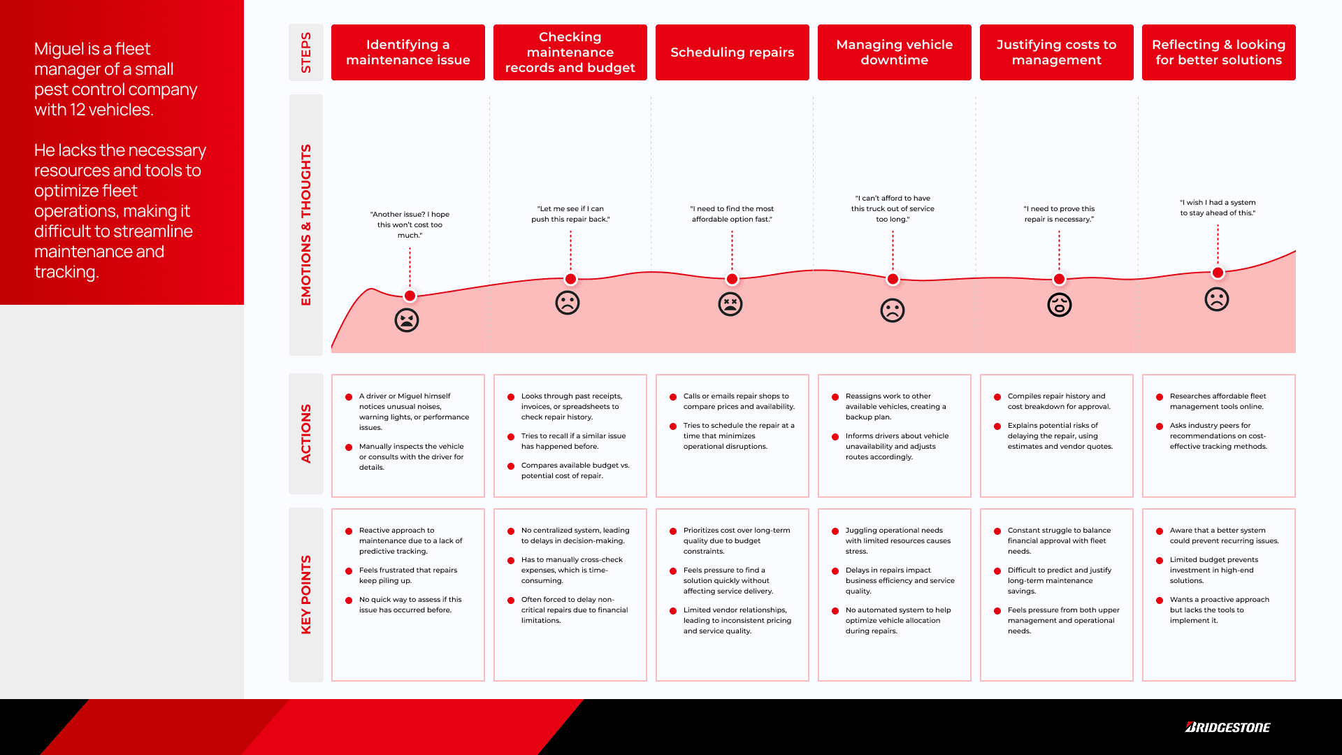
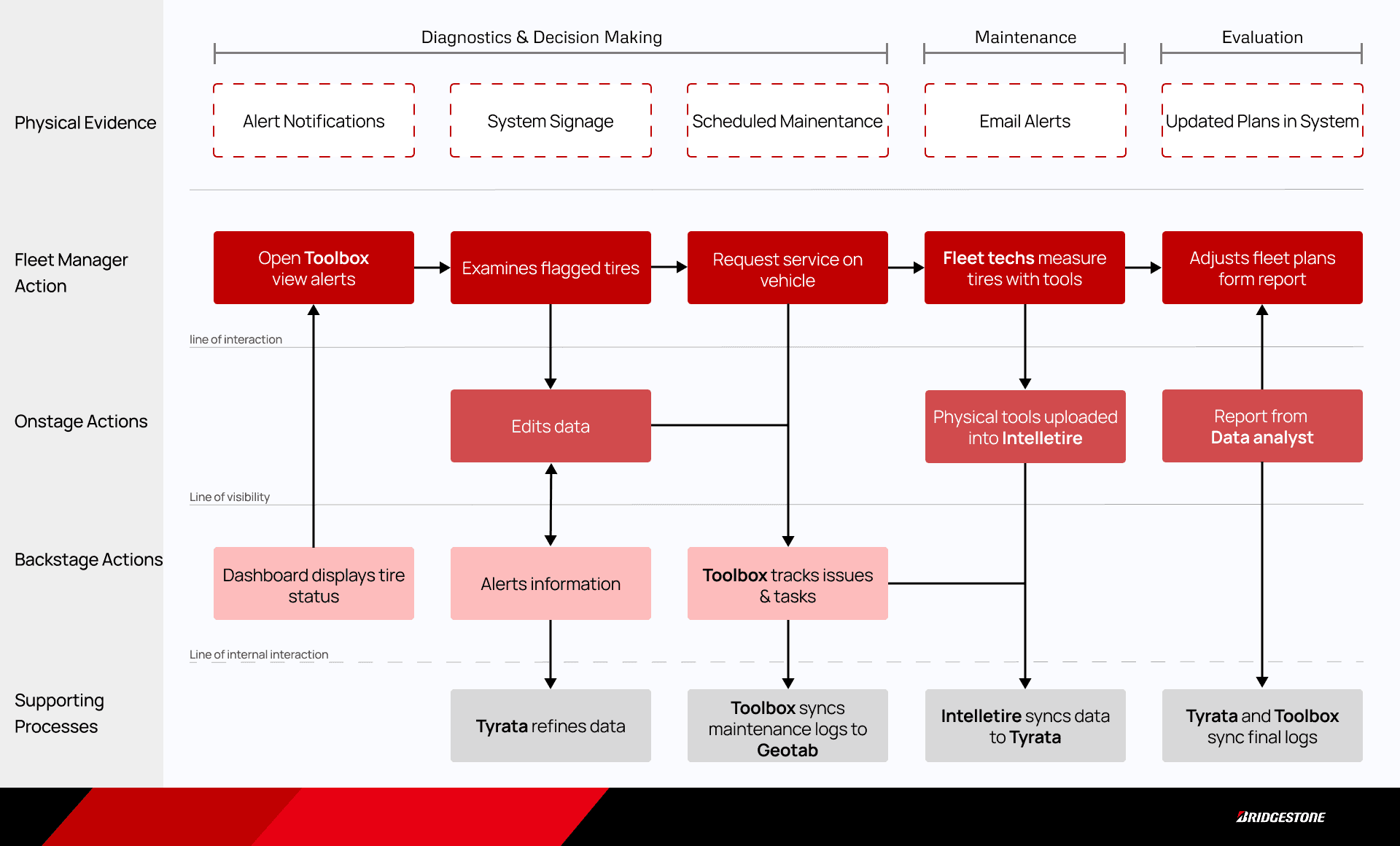
Before moving into the design, our team created personas, journey maps, and a service blueprint to aid us in the process.
Design
Deciding Direction
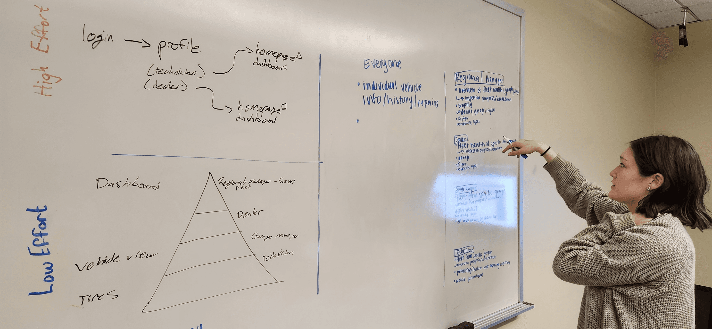
Utilizing the gathered insights in tandem with the research artifacts, we began ideating on the revised system structure. This was where I made my biggest contribution to the end product.
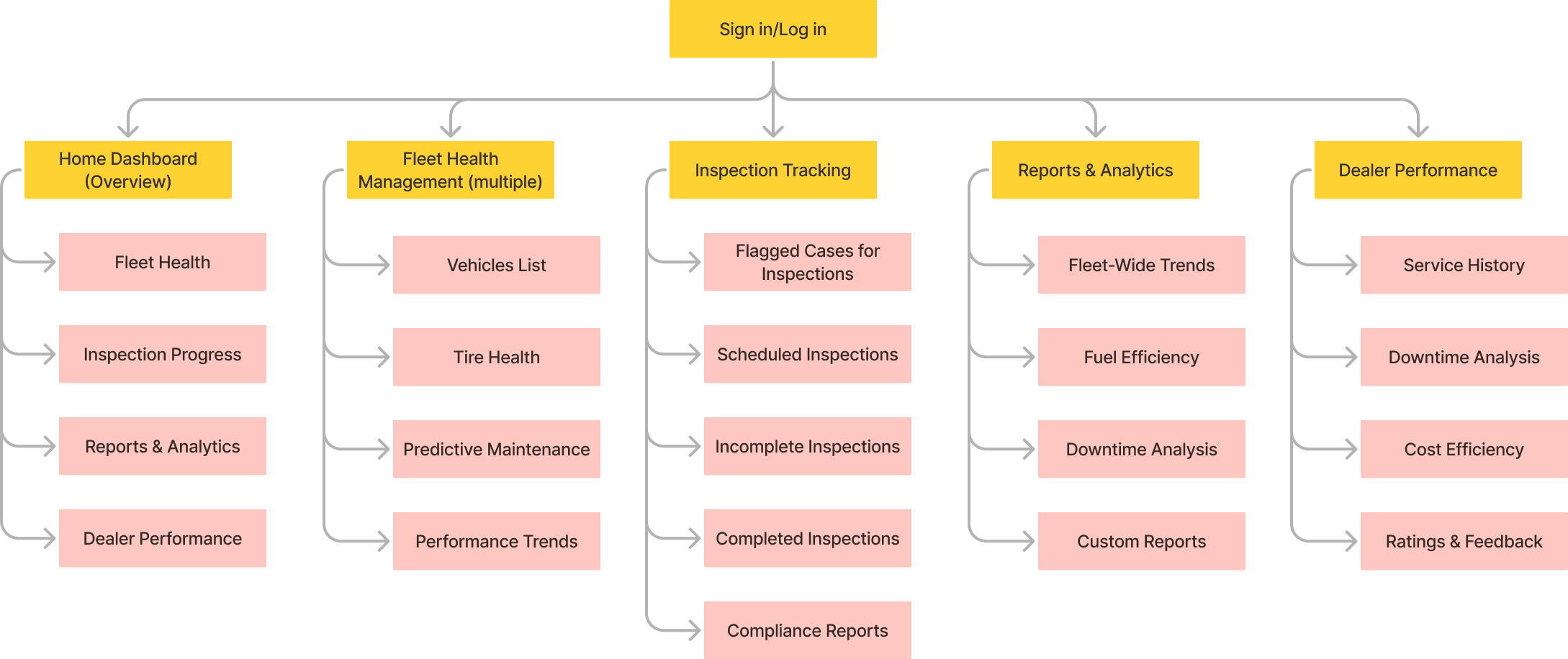
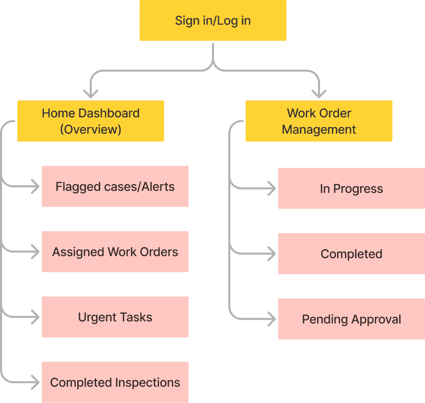
In the current system, each user must log in with a unique account to utilize the software. However, when on the platform, users are bombarded with information that was not useful to their role. Knowing that each user must login to a personal account, and having some features restricted based on the level of that account, acknowledges a unique opportunity to tailor the experience to an employee's needs.
With the idea that I proposed, the team proceeded plotting out the information architecture for the revised system.
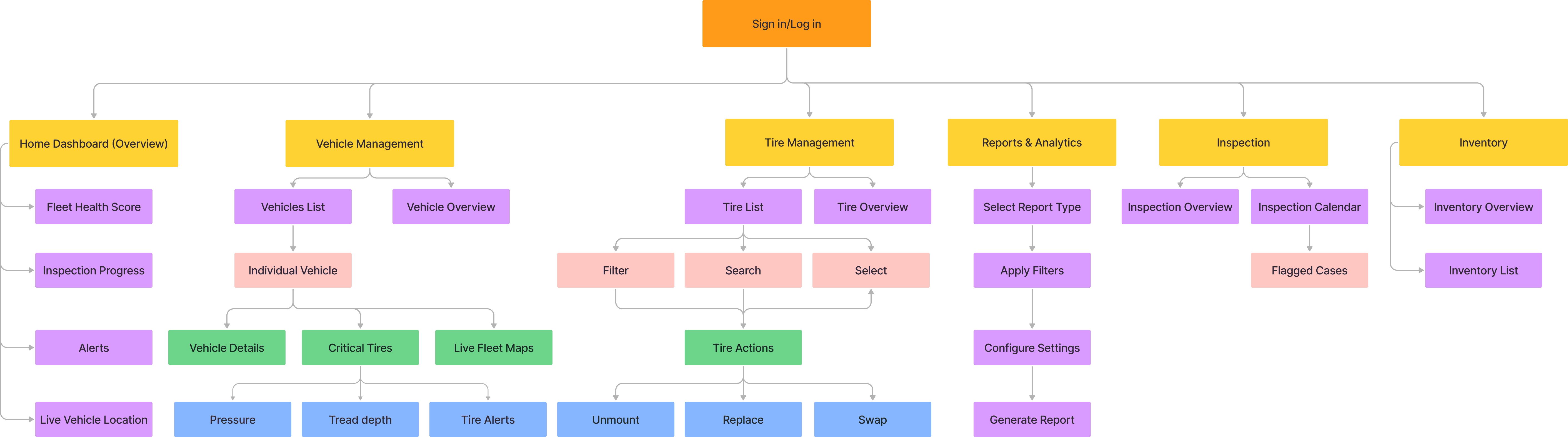
Regional/Fleet Manager
Technician
Dealer
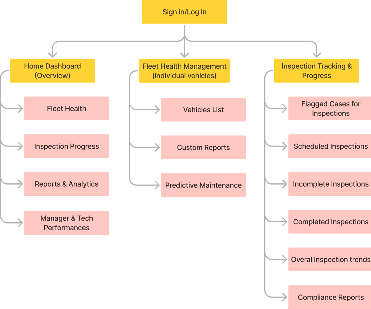
Garage Manager
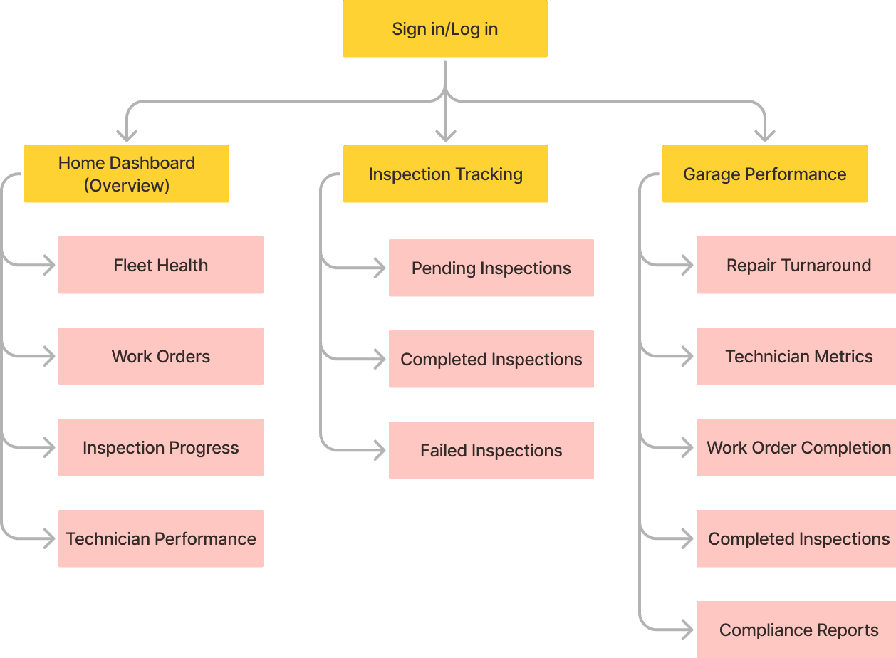
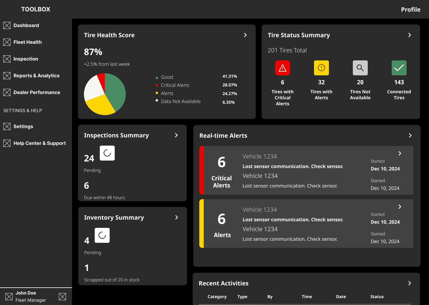
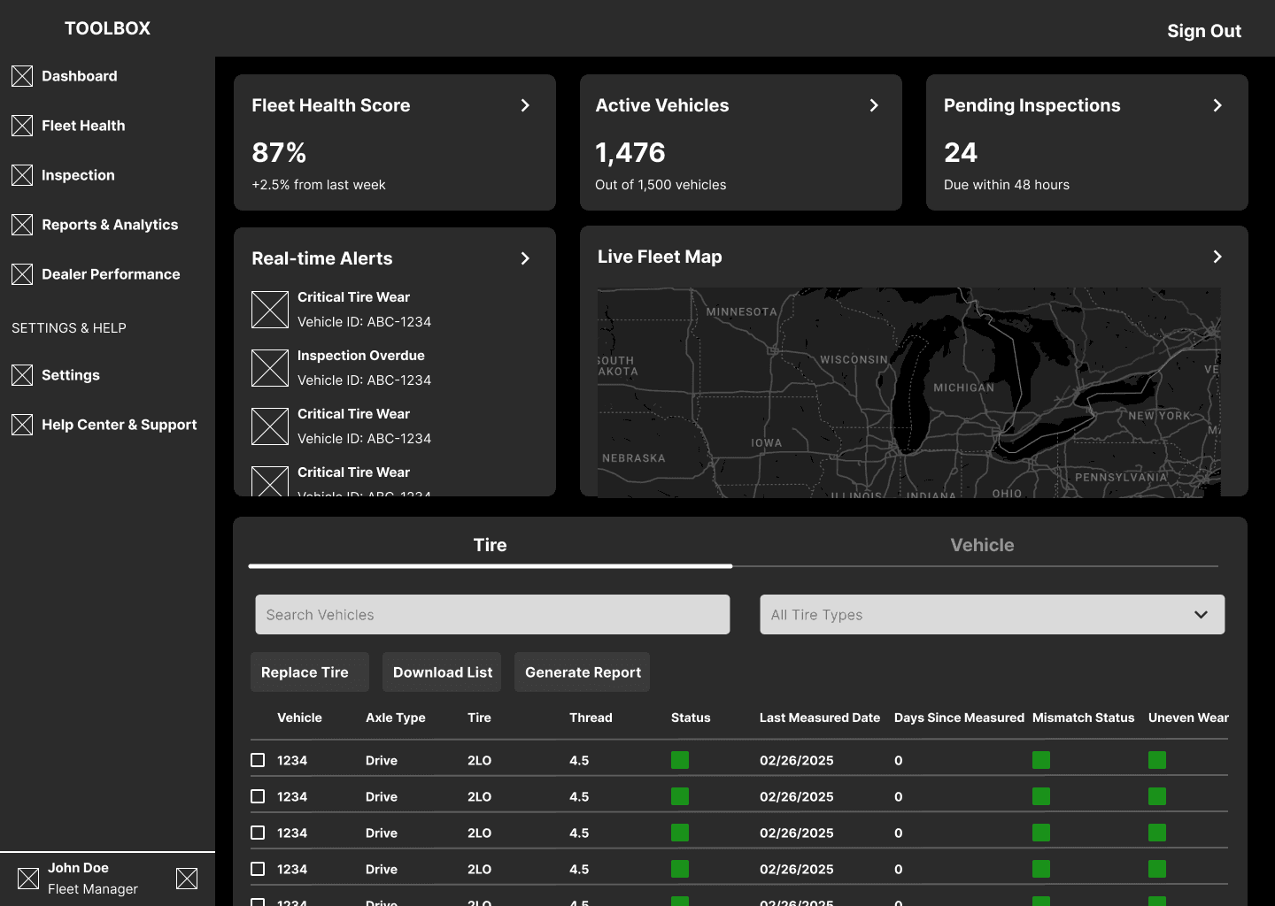
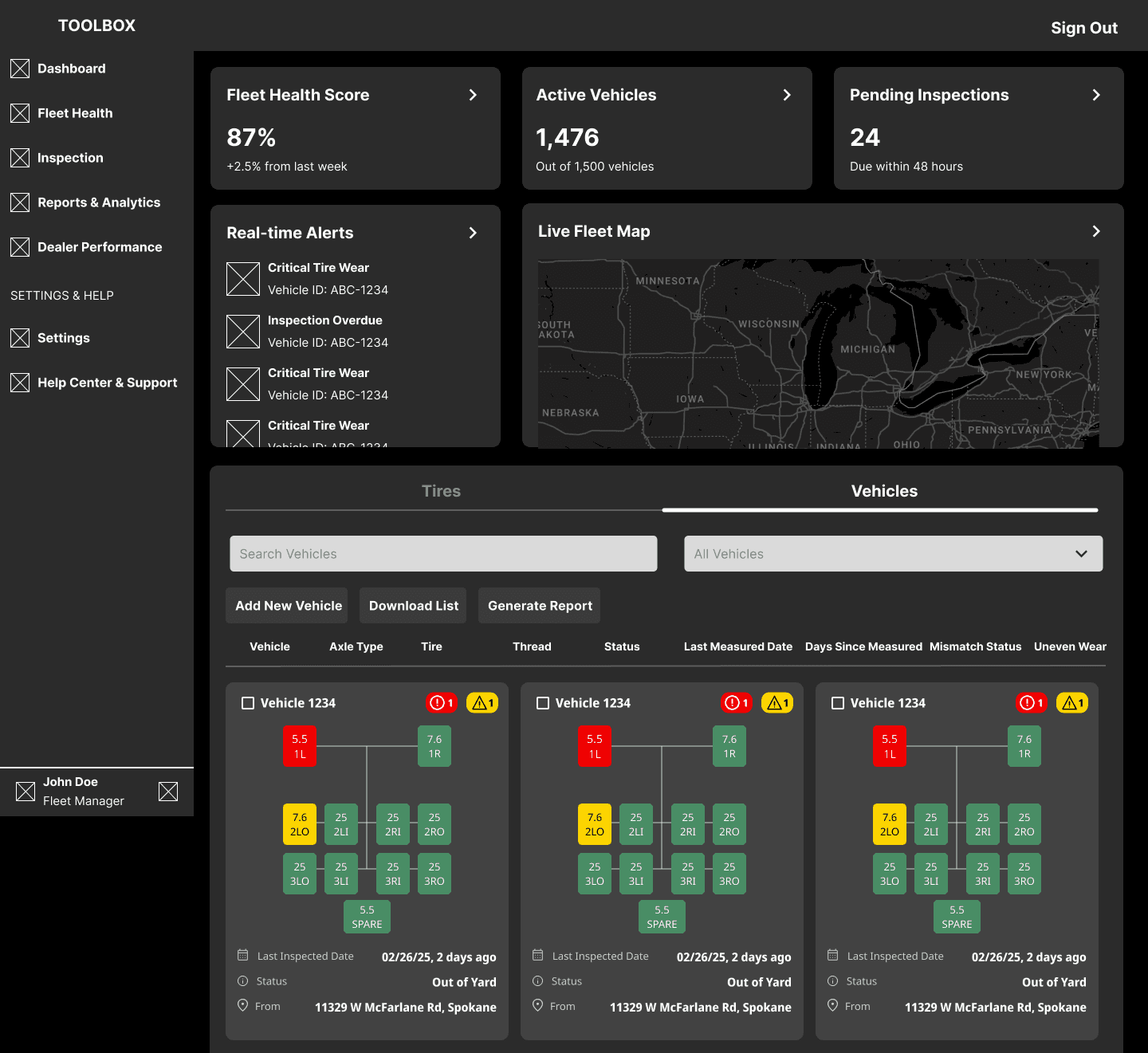
With the structure set up, the team moved onto creating a functional, but visually unpolished prototype. Our next goal was to have real users interact with the design and measure how well it addressed the identified needs.
Mid Fidelity
Iteration
Gathering Feedback
Utilizing our established network, the team proceeded with testing the core functionalities. We interviewed 12 stakeholders across 2 rounds, providing the team invaluable insights to refine our design.
Insights
The ability to generate a fleet health report would save significant time, but wasn’t fleshed out enough.
Some data visualizations were not optimal or were not useful to primary responsibilities.
Alerts severity scale and immediate concerns where what users cared about most.
Regular actions were not as accessible as they should have been.
High Fidelity
With a deluge of welcome critique, the team moved onto addressing the identified issues.
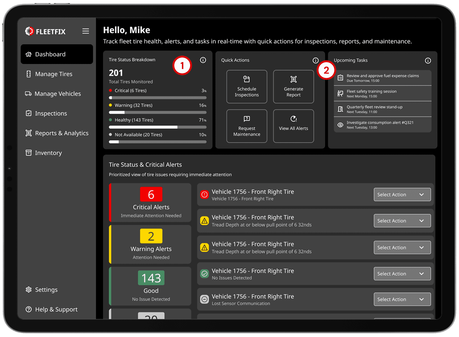
Home Dashboard
A customizable dashboard that highlights overall fleet health metrics in a digestible and actionable format.
1.
Data visualizations were refined to be more situationally appropriate and provide necessary details at a glance.
2.
Upcoming Tasks and Quick Actions placed prominently for easy access.
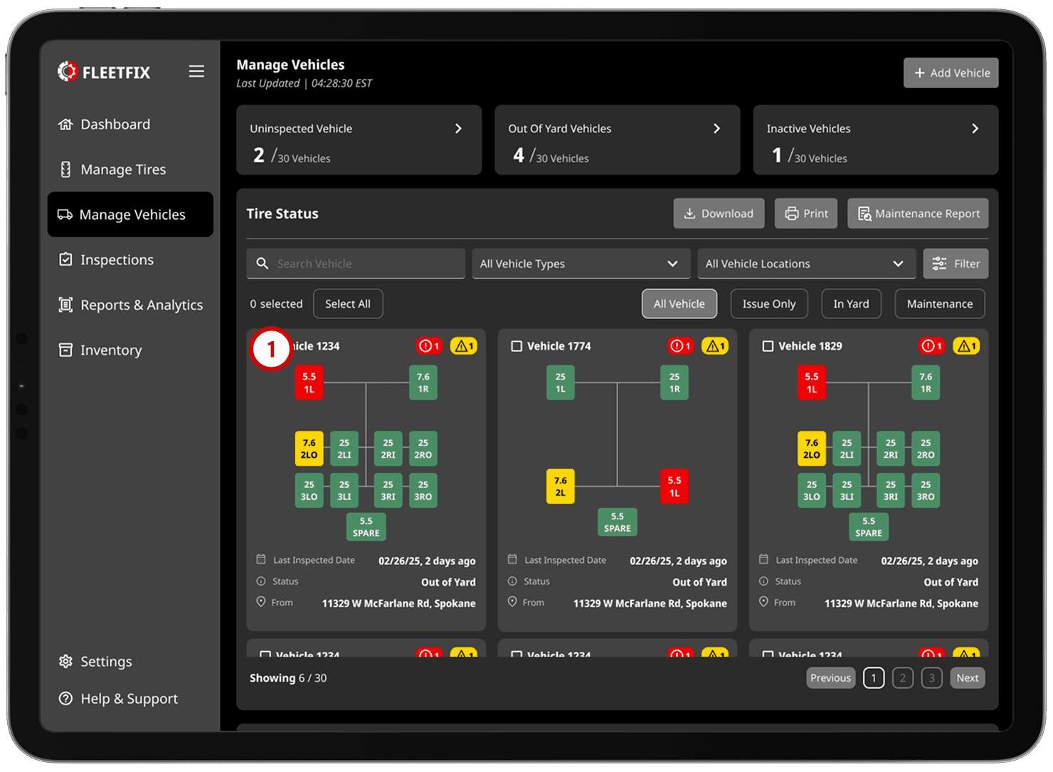
Vehicle Management
A vehicle-view of a fleet that provides deeper understanding of individual vehicle tire status, location, and inspection state.
1.
Card view provides intuitive visualization for vehicles, with the most serious issues pushed to the top of the list.
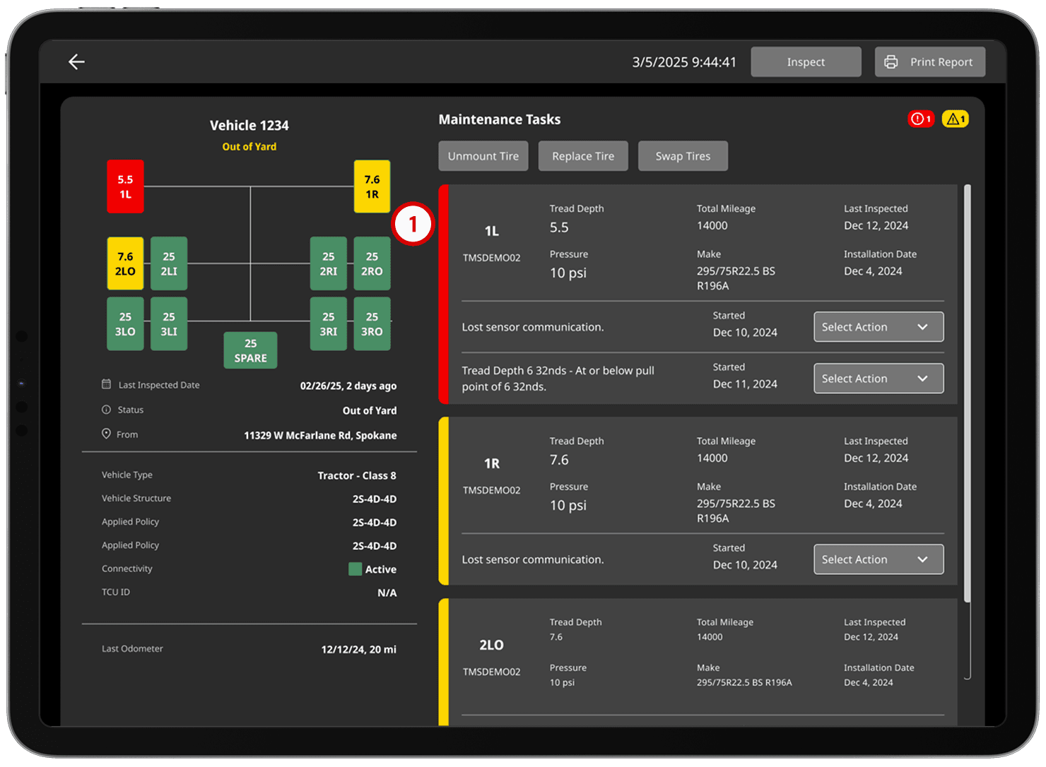
Specific Vehicle
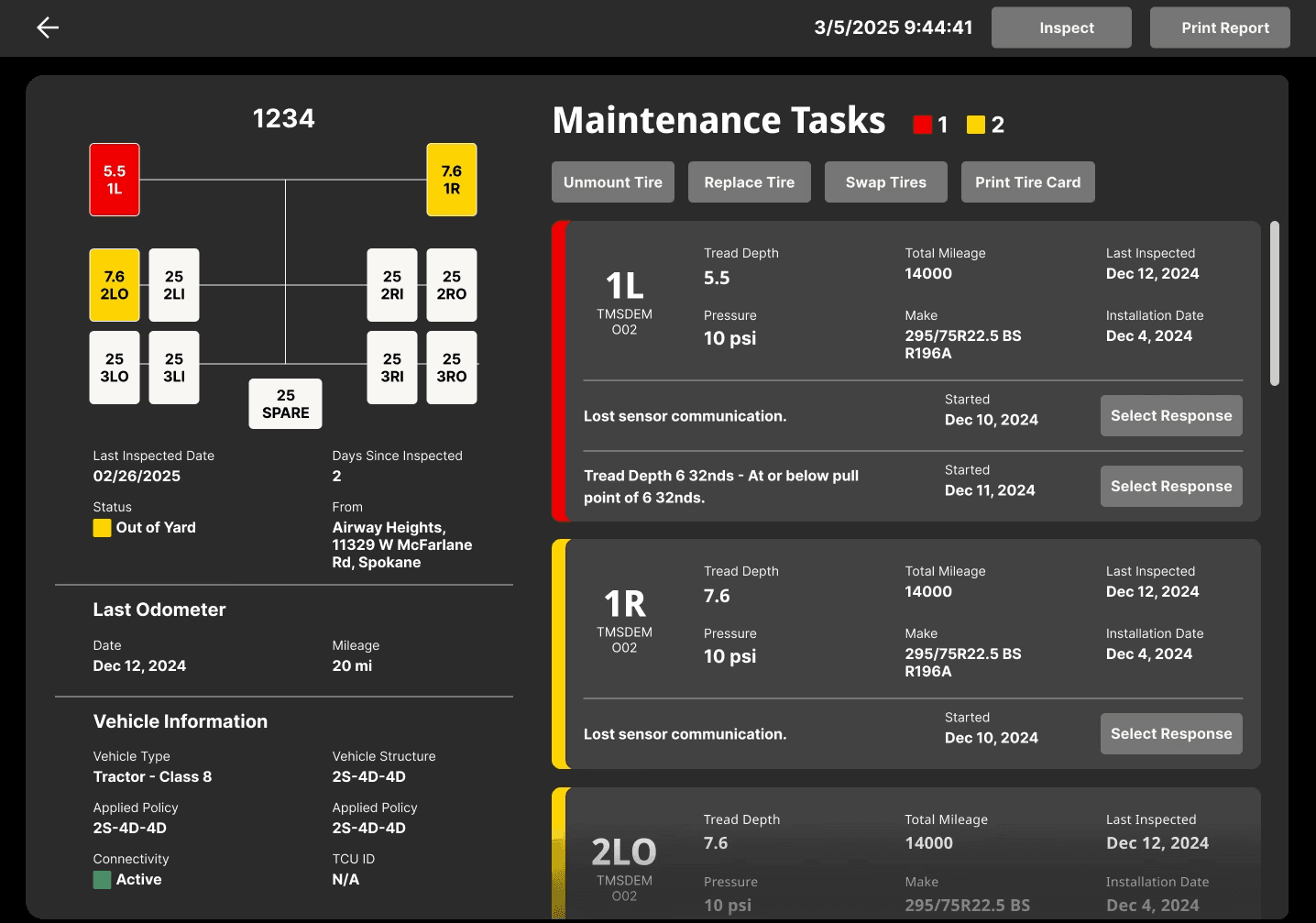
An individual vehicle-view that provides a deeper inspection of status, actions, and vehicle history.
1.
Alert level visual language was applied uniformly throughout the design, quickly indicating what issues require attention immediately.
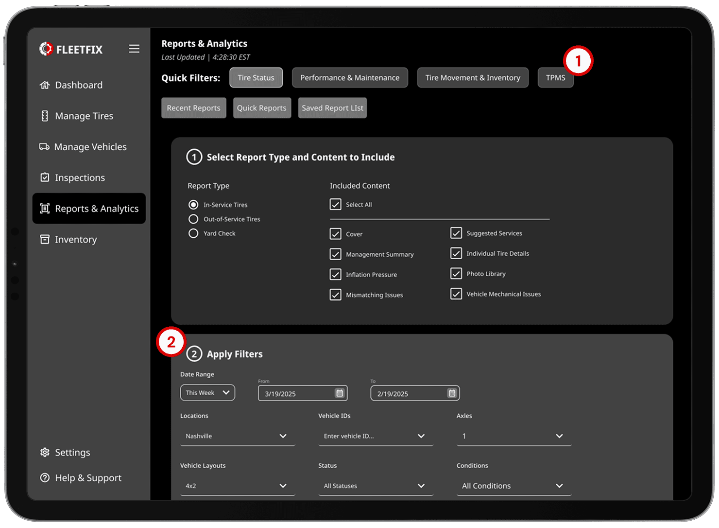
Fleet Analytics & Reporting
Report generation was greatly expanded upon, granting users the ability to intricately customize each document.
1.
Presets expedite generation of regular documentation.
2.
Filters can now be set for highly customizable reports.
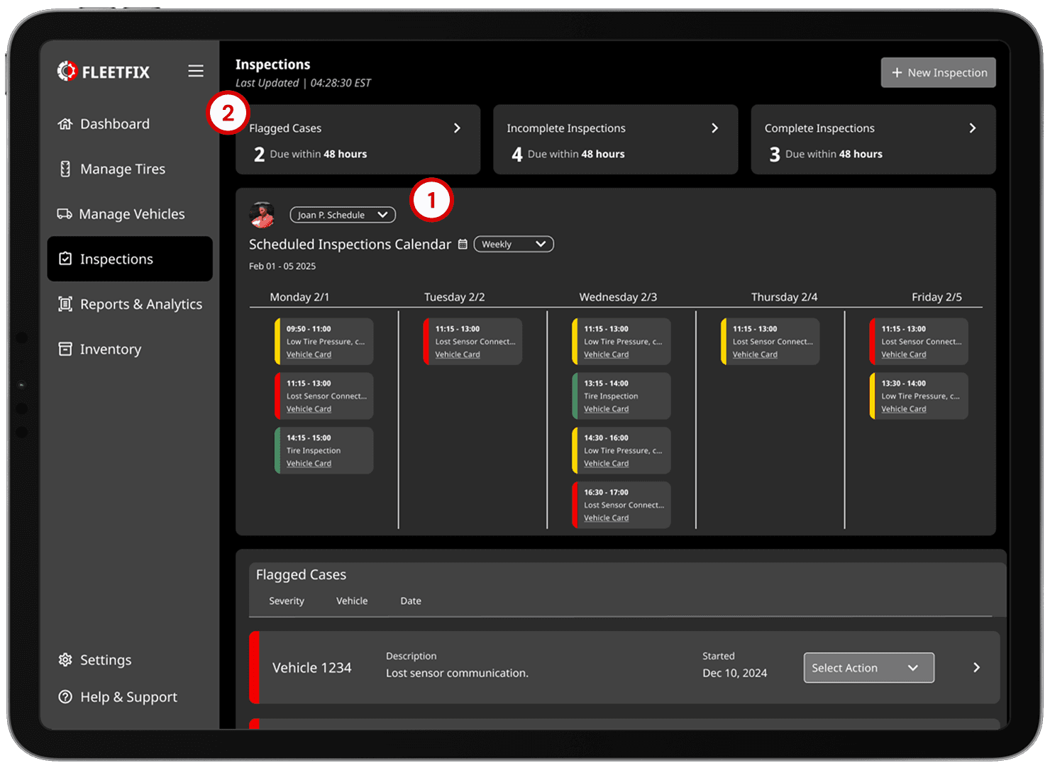
Calendar
The task calendar was fleshed out to give users a clear direction, reducing cognitive load and increasing operational efficiency.
1.
Schedules for all staff members is available, and fleet managers can add and edit schedules for easy assignment.
2.
Flagged cases and inspectional status are displayed at the top of the page for easy assessment of fleet inspection state.
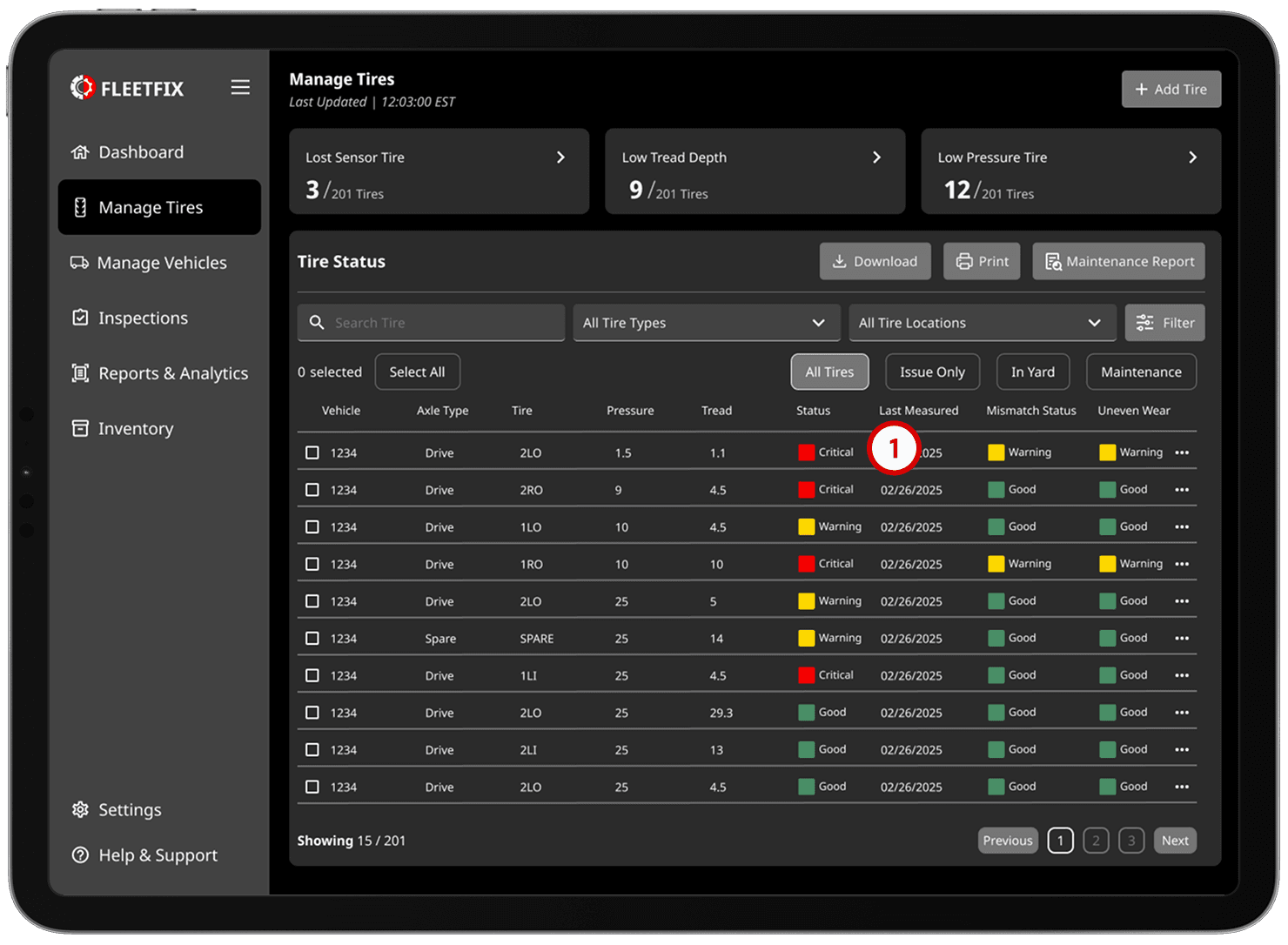
Tire Management
Displays the entire fleet’s actively used tires.
1.
Easily scannable health status, with most important issues situated higher on the list and on top of the page.
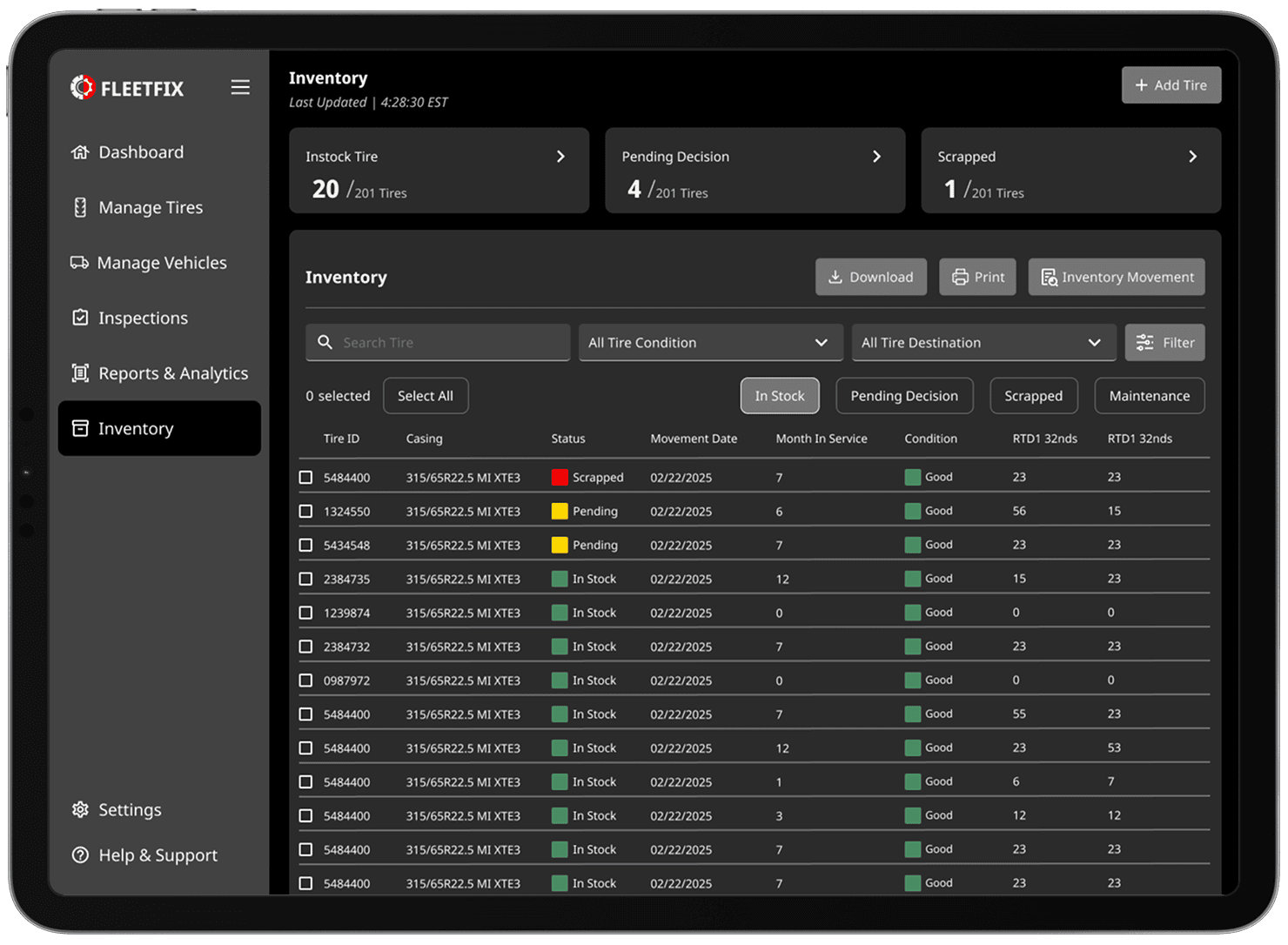
Tire Inventory
Shows all tires sitting in reserve, not on vehicles. Users can select tires, choose actions, and view all information on any specific tire.
Mobile Experience
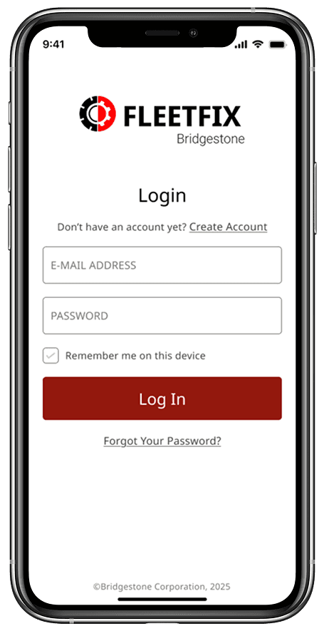
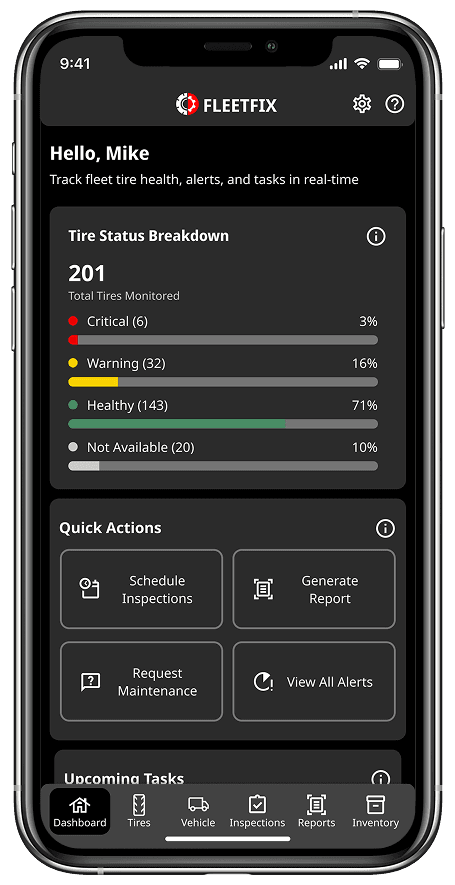
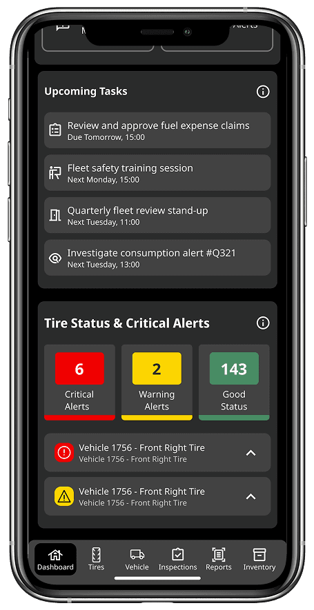
Usability Testing
Methodology
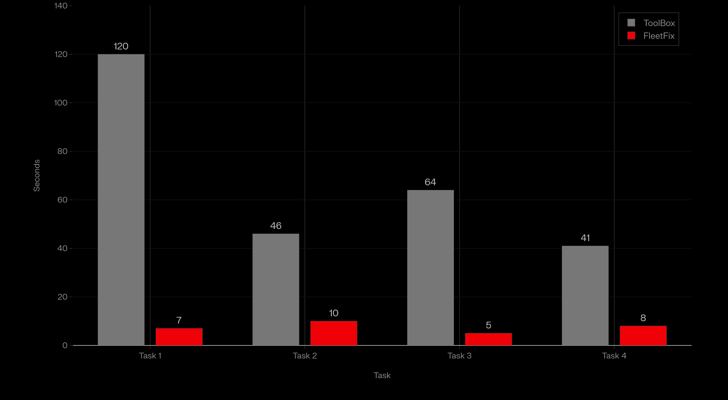
With our final prototype complete, we ran 16 usability tests. The goal of this final round of testing was to compare the same essential activities across both Toolbox and our design.
Tasks
1.
Find what vehicles are in utmost need of maintenance.
2.
Generate a fleet health report for the past week.
3.
Locate the second upcoming item in the maintenance schedule.
4.
See what previous maintenance has been done on a specific vehicle.
After completing these basic tasks, users were prompted to engage with the system further before answering a post test questionnaire. The questionnaire included a simple system usability scale and a brief interview.
Results
90% increase
In Workflow Efficiency
75% reduction
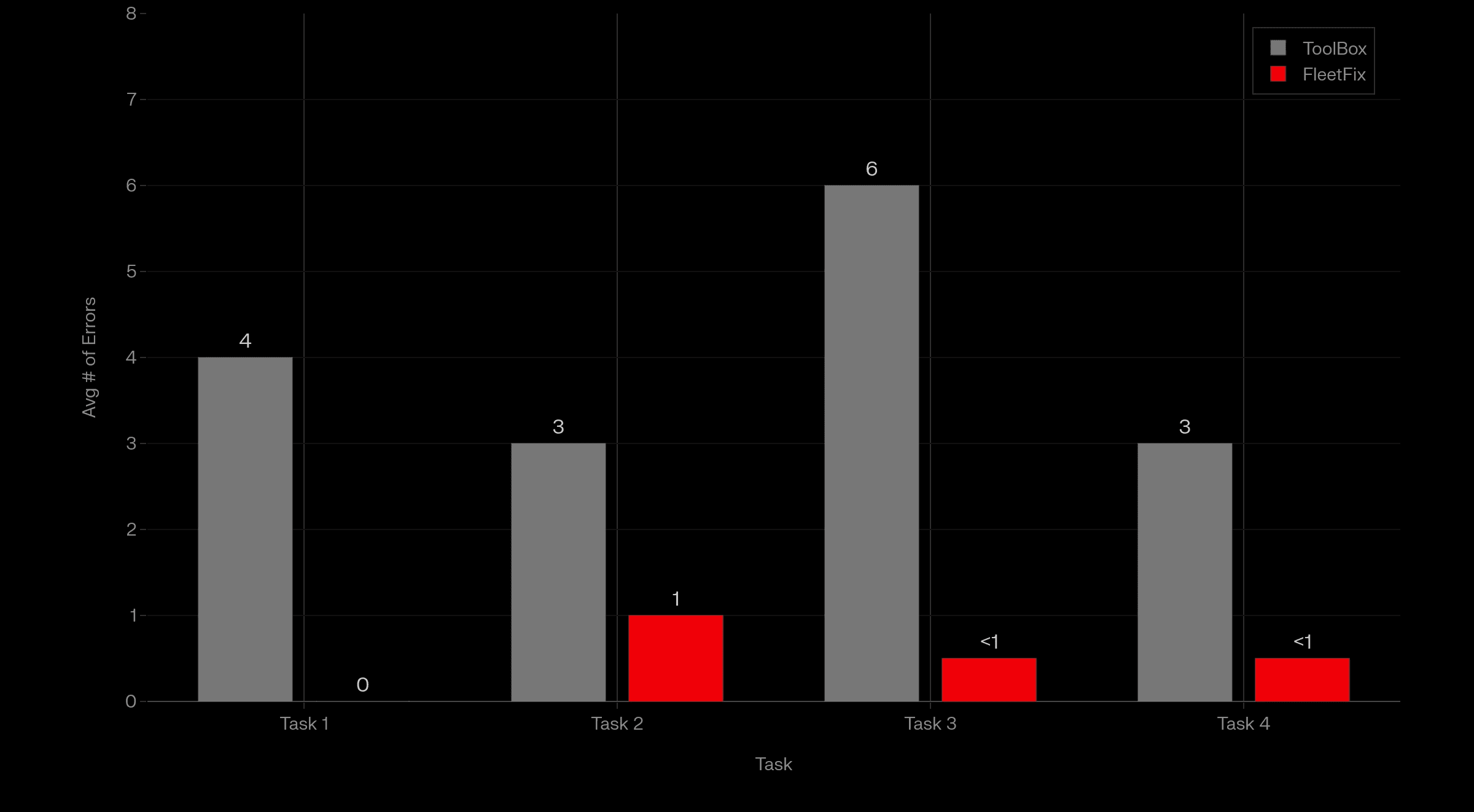
In User Errors
0 failed tasks
Across Usability Tests
User Quotes
“This platform understands how Bridgestone systems are connected. I like how it makes it easy for me.”
“It felt like nested boxes to get where I want to go [in Toolbox]. FleetFix doesn’t feel that way.”
“I thought it was a trick question to find [a feature in Toolbox], because I couldn’t find where it was. Everything is so much easier to find in FleetFix.”
Metrics
Average Amount of Mistakes Across Tasks
Average Time to Complete Task
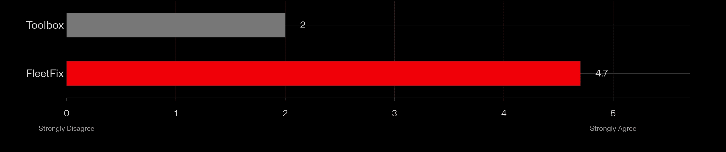
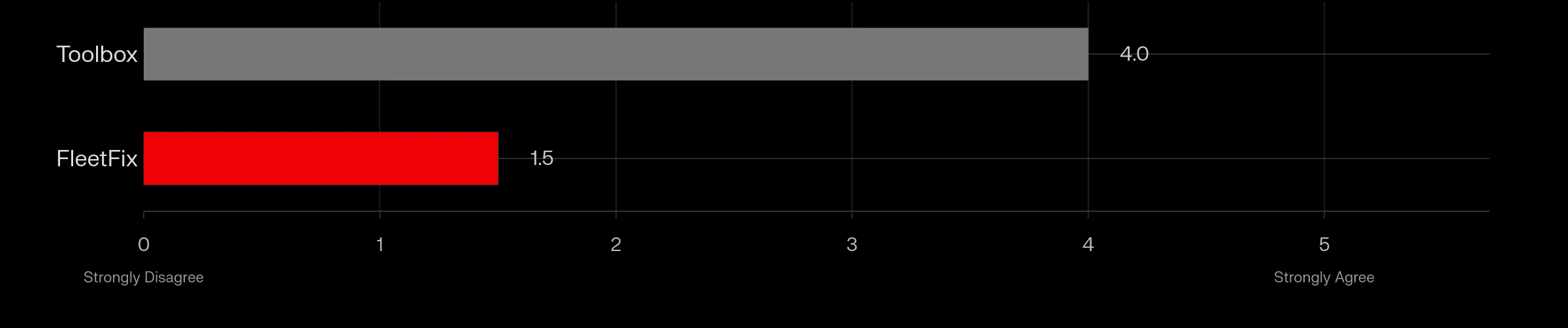
I thought the system was straightforward and simple to use
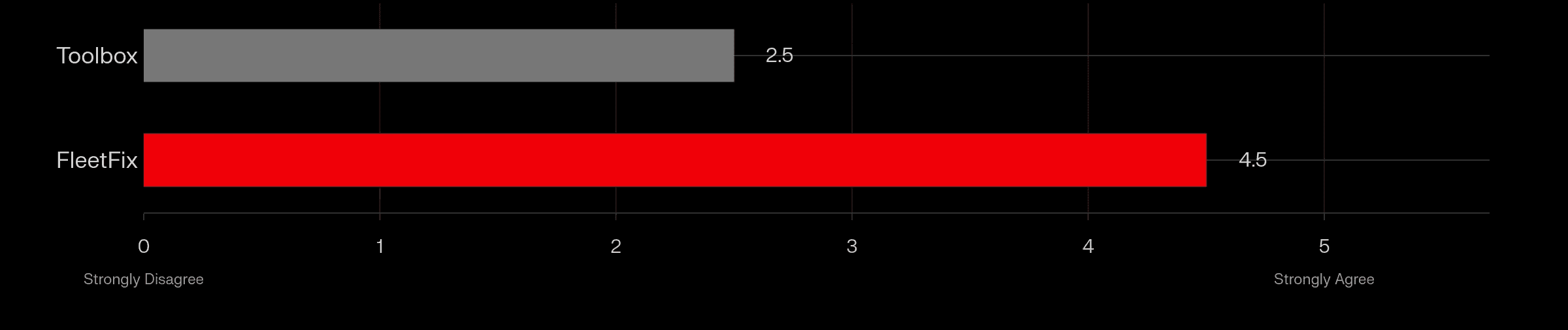
The features in the system seemed to work well together
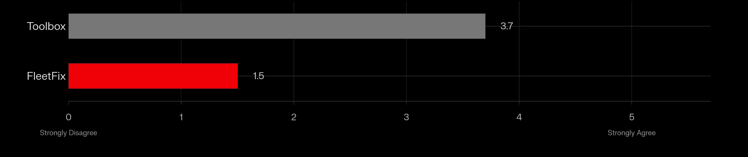
I found some parts of the system more complicated than I expected
I noticed parts of the system that felt inconsistent or unclear
Conclusion
Project
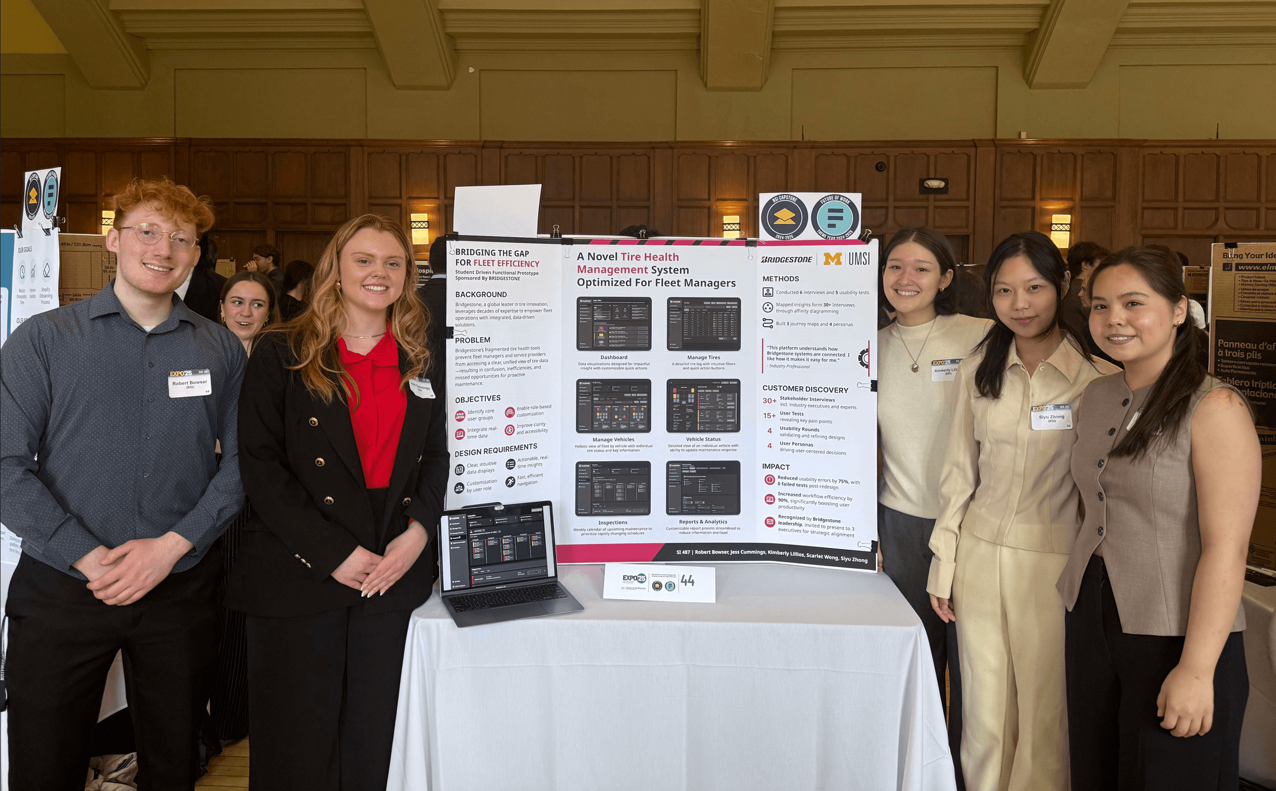
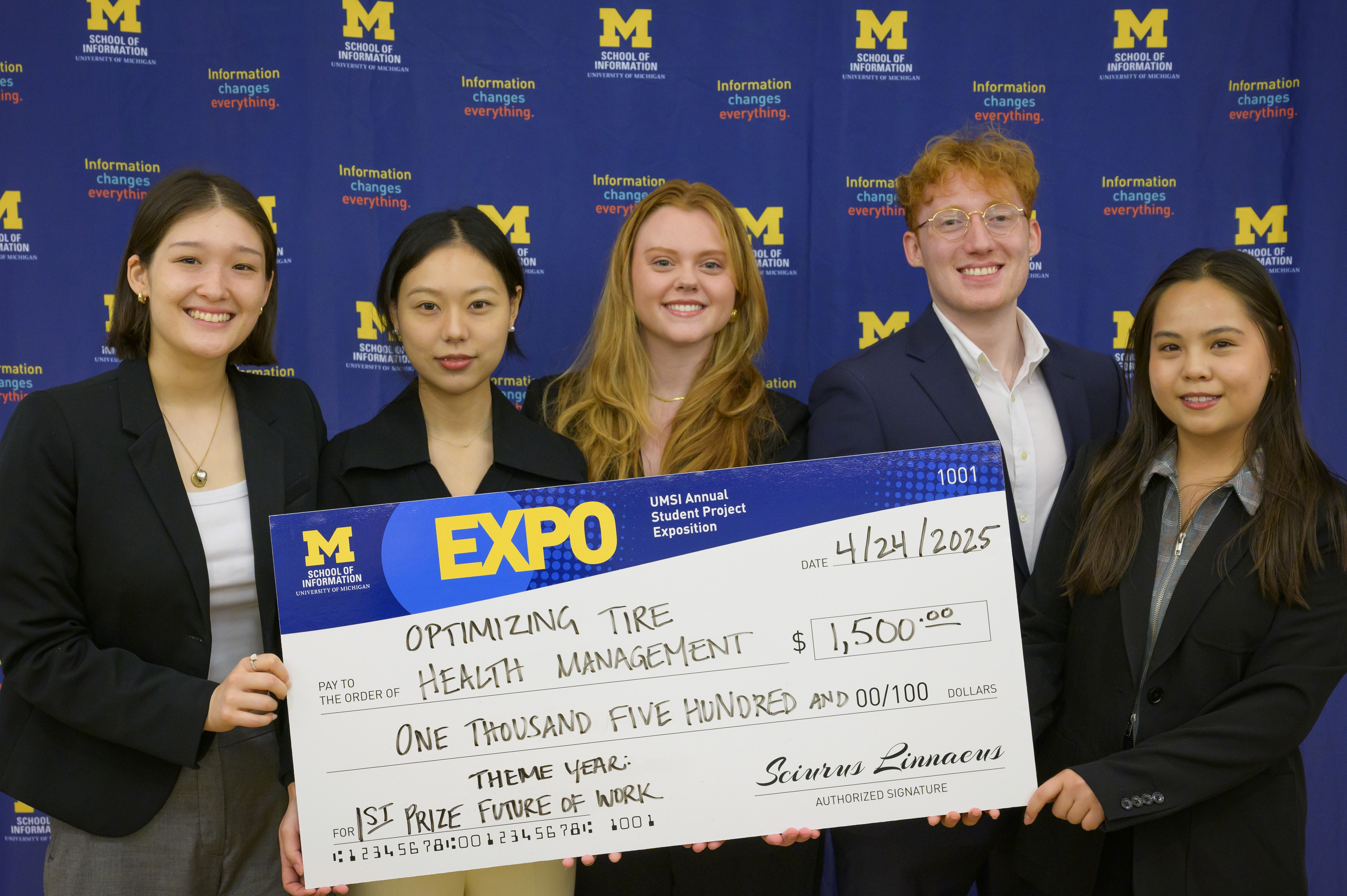
After writing the handoff documentation, our team wrapped up the project with a presentation to 3 executives and a display at the UMSI 2025 expo. With over 200 projects showcased at the event, our team was honored to win 1st place in the expo's theme category: Future of Work.
Reflection
From start to finish, this project was a step up in scope compared to previous experiences. Navigating through the immense number of existing software services, the depth of the subject matter, and speaking to a staggering amount of kind, helpful experts was nothing short of amazing.
The 8 month timeline was also a new experience, this increased duration displayed to me how real-world projects could easily span over a year. Great things take time, and there was still so much more to learn, implement, and test.