Role
Product Manager / UX Team Lead
Timeline
August 2025 - December 2025
Team
1 Product Manager, 2 UX Designers, 3 UX Researchers, 3 Software Engineers
Background
Business
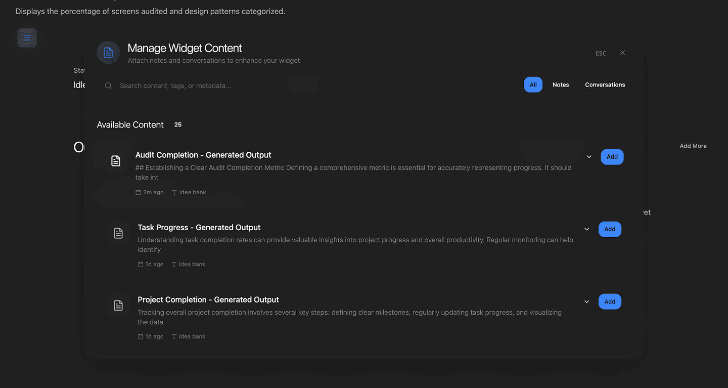
PersistOS is a startup with award winning technology for AI memory and personalization. Currently, their product, HeyContext, has it's value shrouded by a lackluster user experience.
Product
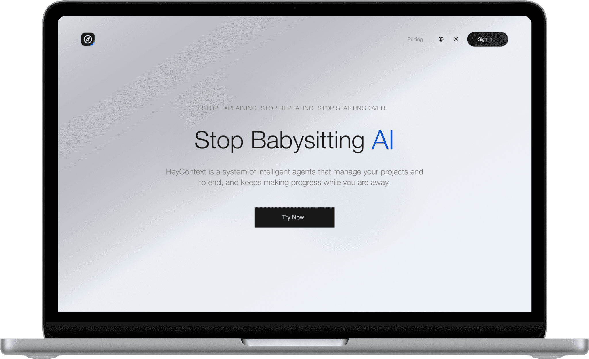
HeyContext is an AI workspace where groups of specialized agents coordinate autonomously.
Current Poor User Experience
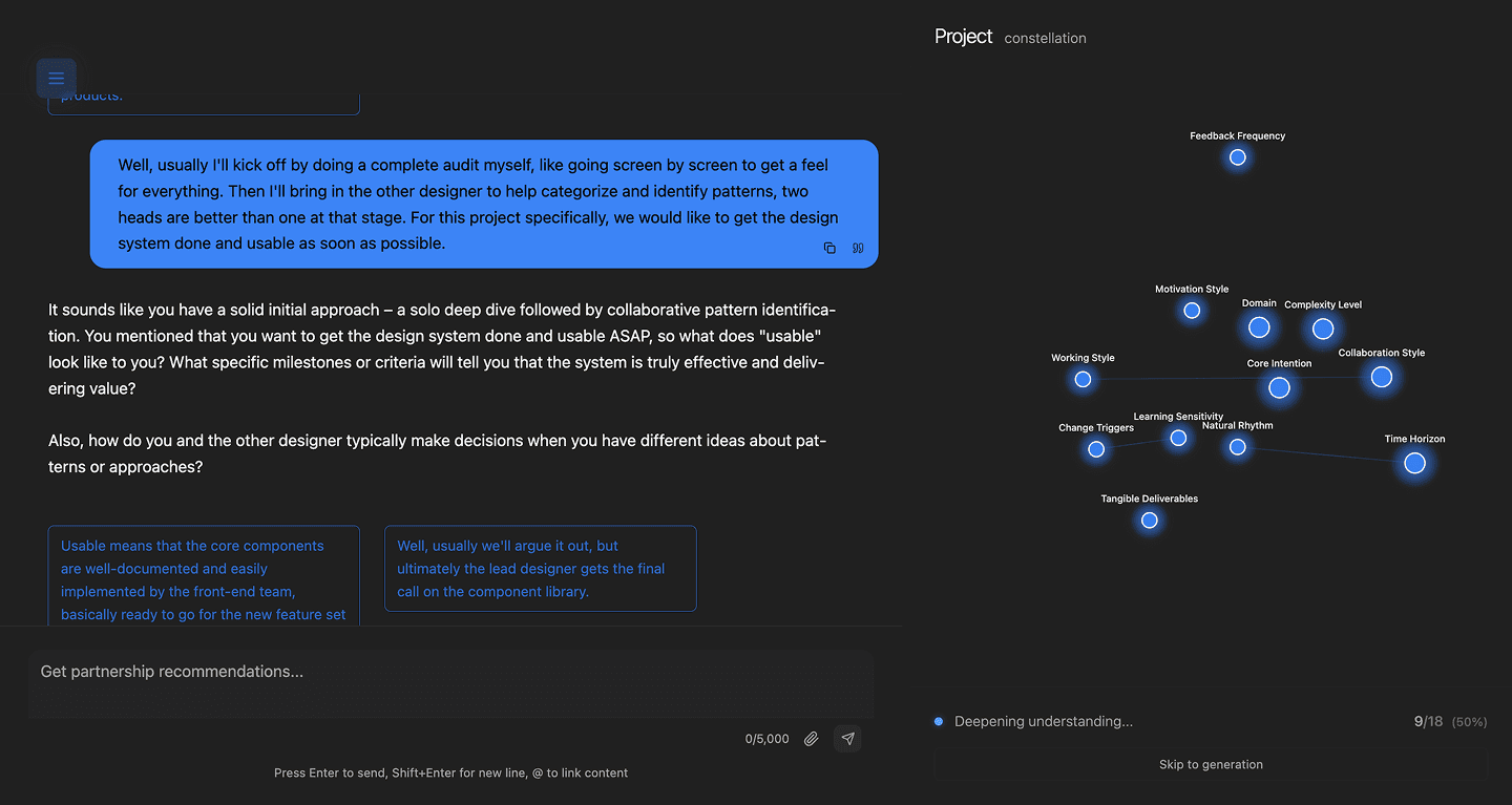
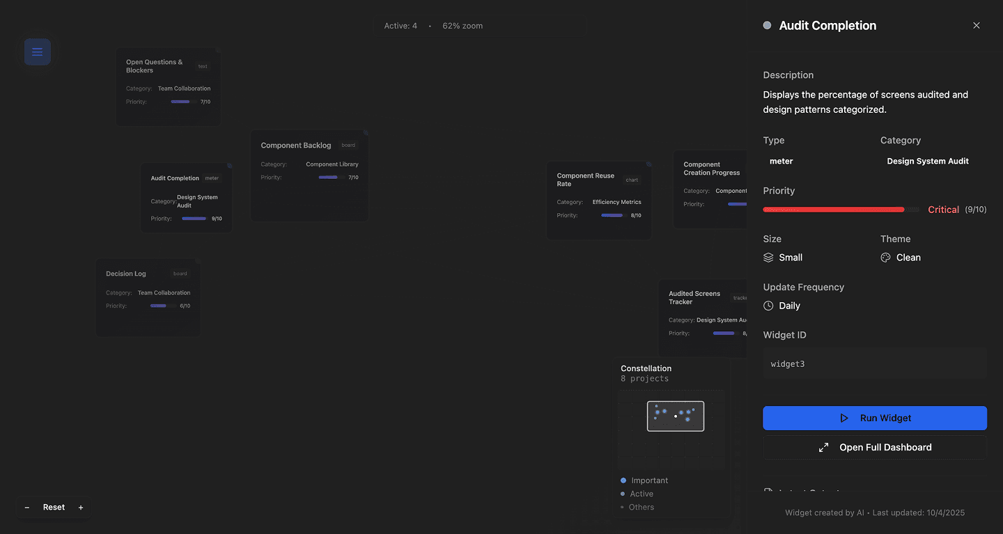
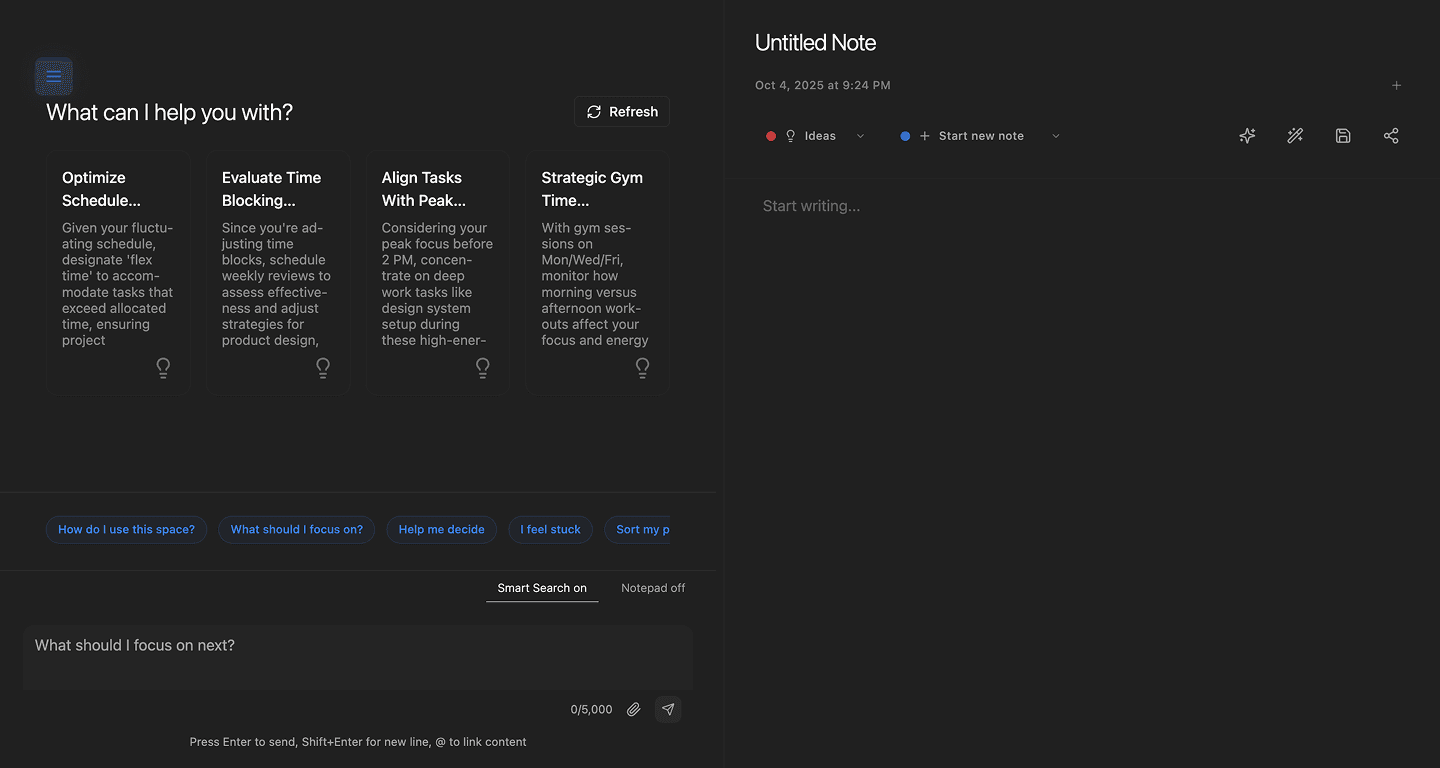
Objective
Redesign the HeyContext platform to better communicate and deliver users the value that the PersistOS’s unique technological approach offers. A desired outcome would look like an increase in engagement metrics.
Site Traffic
Account Sign-ups
User Retention
Research
Platform Software
Starting with the foundation of the service, I worked with the engineers to map out the system architecture.

Thanks to enthusiastic explanations from the engineers, I was able to gain an understanding of the software’s functions. The platform contained several novel solutions that will help set us apart from competitors.
Features
Assessing Market Landscape








What Users Are Saying
The research team sought to understand popular sentiment surrounding competing services, as well as the specific focuses of HeyContext. This was done by looking at online posts and conducting interviews. Once a significant number of perspectives were coalesced, they were sorted into an affinity map.
"When I initiate a new conversation or switch between different models, I often find myself re-explaining the same background details, objectives, or context"
"Every interaction resets to square one. You have to reiterate your technology stack, redefine your preferences, and reintroduce context that should already be evident"
"After spending hours troubleshooting a problem, you return the next day to find a generic greeting, as if we hadn't just spent an entire day discussing intricate details"

Design
Defining Core Features
How can we address market demand while balancing the realistic scope of our situation? Our goal is to provide a unique value proposition and target a subsection of the AI workspace market. We're aiming to reduce the barrier for getting maximum value from AI tools. We’ll achieve this by decreasing input effort.
Must Haves
To achieve our goal, the team defined the most important features of our service. These features were based on the structure of competitors' services and from speaking to users directly.
Structure
The first step to achieving our goals was organizing the platform to incorporate the primary advantages of our service into the core product flow. With this in mind, the team laid out the site map.

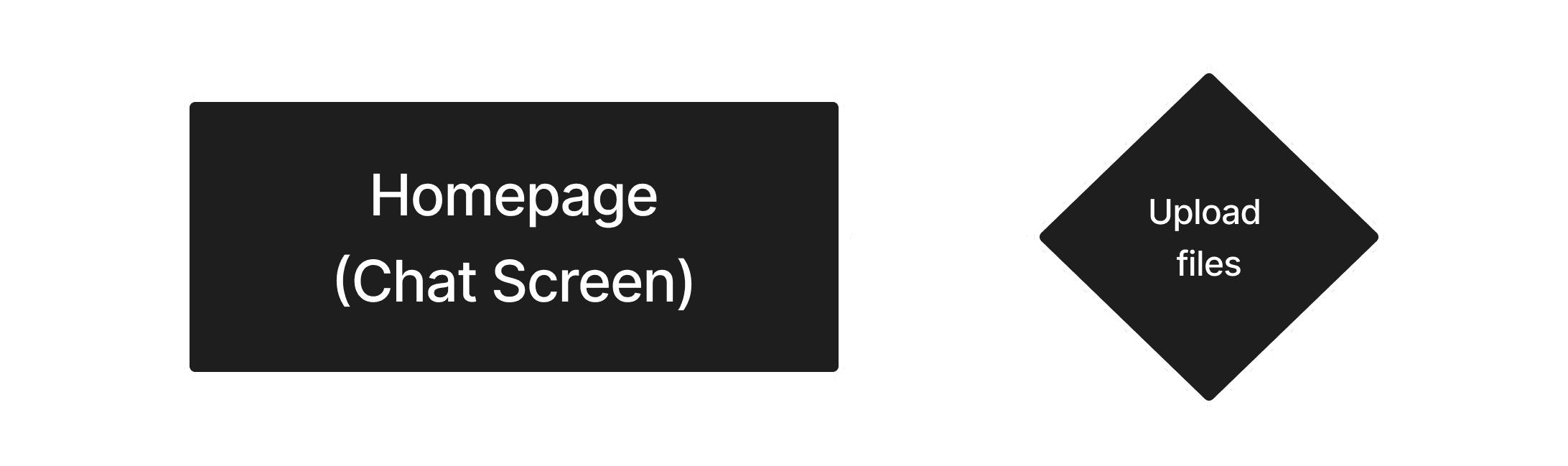
In updated structure, I pushed the flow that mattered most to users, the chat, to be the central focus of the homepage experience. This also aligned ourselves with standards across the industry, allowing for new users to intuitively interact with the service.
Old Chat Flow

New Chat Flow
Interface
With each page’s details set in place, the design team moved onto the visual presentation. Building off of the previously established branding, the design team began assessing potential visual direction.
Quick Idea 1

Quick Idea 2

Design System
Consolidating our visions, the design team established a foundational design system. The system was paired with full documentation describing the use of each element for AI development tools once handed off to the engineers.


Low Fidelity Mockups
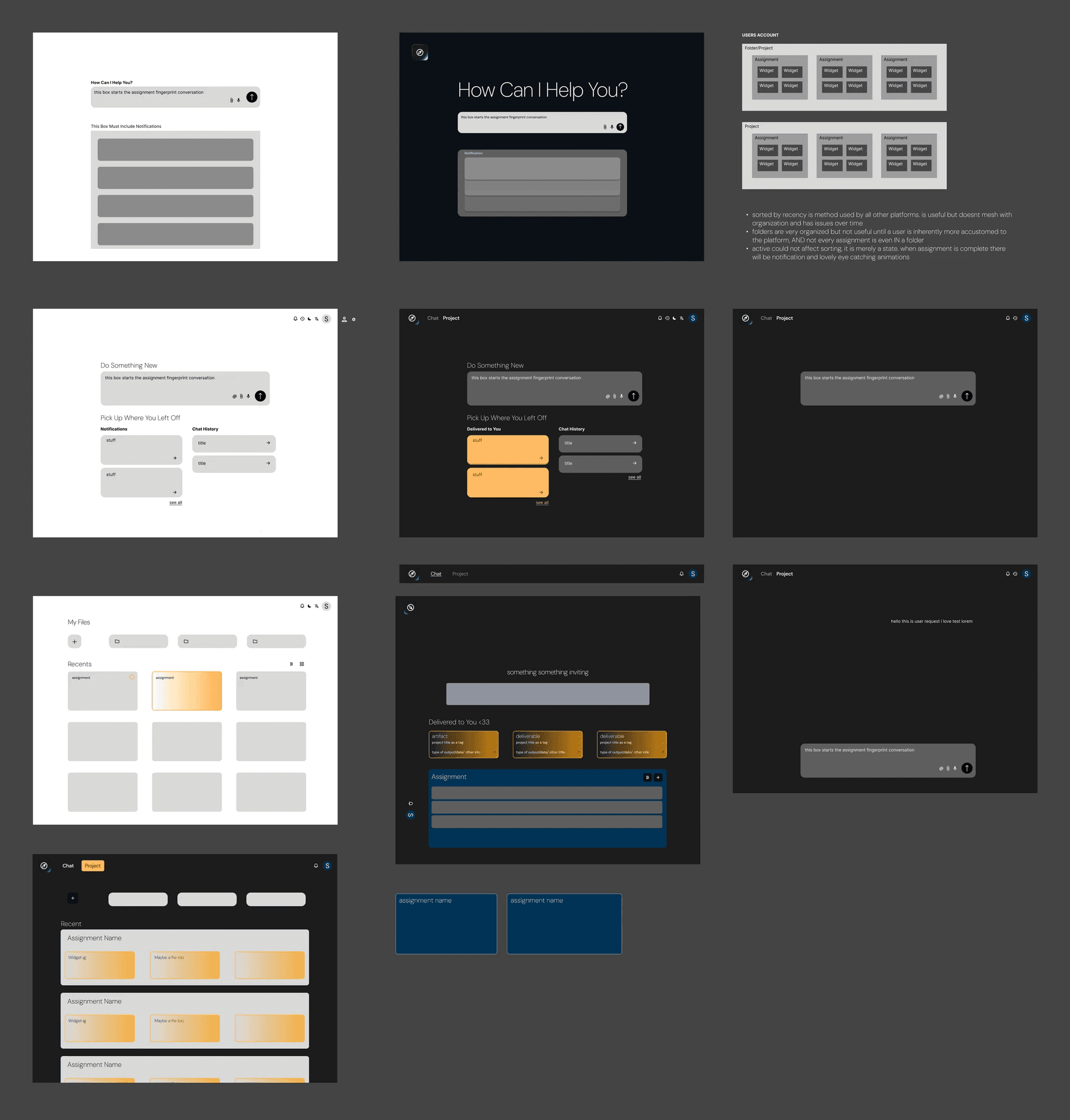
With the system in place, it was time to begin piecing together the experience's visual layout. I started this process with low-fidelity mockups.
The most notable change that was made in this rendition was cutting the constellation screen, which had served as a visual representation of file clustering. The screen had become unconsciously accepted as part of the product, but as we progressed, it was now conflicting with the service's goals.
Mid Fidelity Prototype
With the basic layout in place, the design team quickly constructed a mid fidelity prototype, expanding on the previous screens and fleshing out the location of features.

With the new structure and visual identity developed, the prototype was handed off with assistive documentation for developers to use as the base of the update.
Outcome
Launching Update
After the engineering team pushed the update live, we allowed a brief period for users to interact with the product. Then we began measuring how well we had addressed our objectives and where we could improve the product in the future.
We performed 14 usability tests with the revised product, and ran a community survey deployed through email to those who created accounts on the platform.
Results
41% Increase
In User Satisfaction
1k Users
First 2 Weeks
60k Visitors
First 2 Weeks
User Quotes
"I'm so happy that I don't have to describe what I am working on again and again."
"It's like a thinking companion that organizes not just tasks, but meaning. It feels almost like my proxy, and it understands who I am."
Reflection
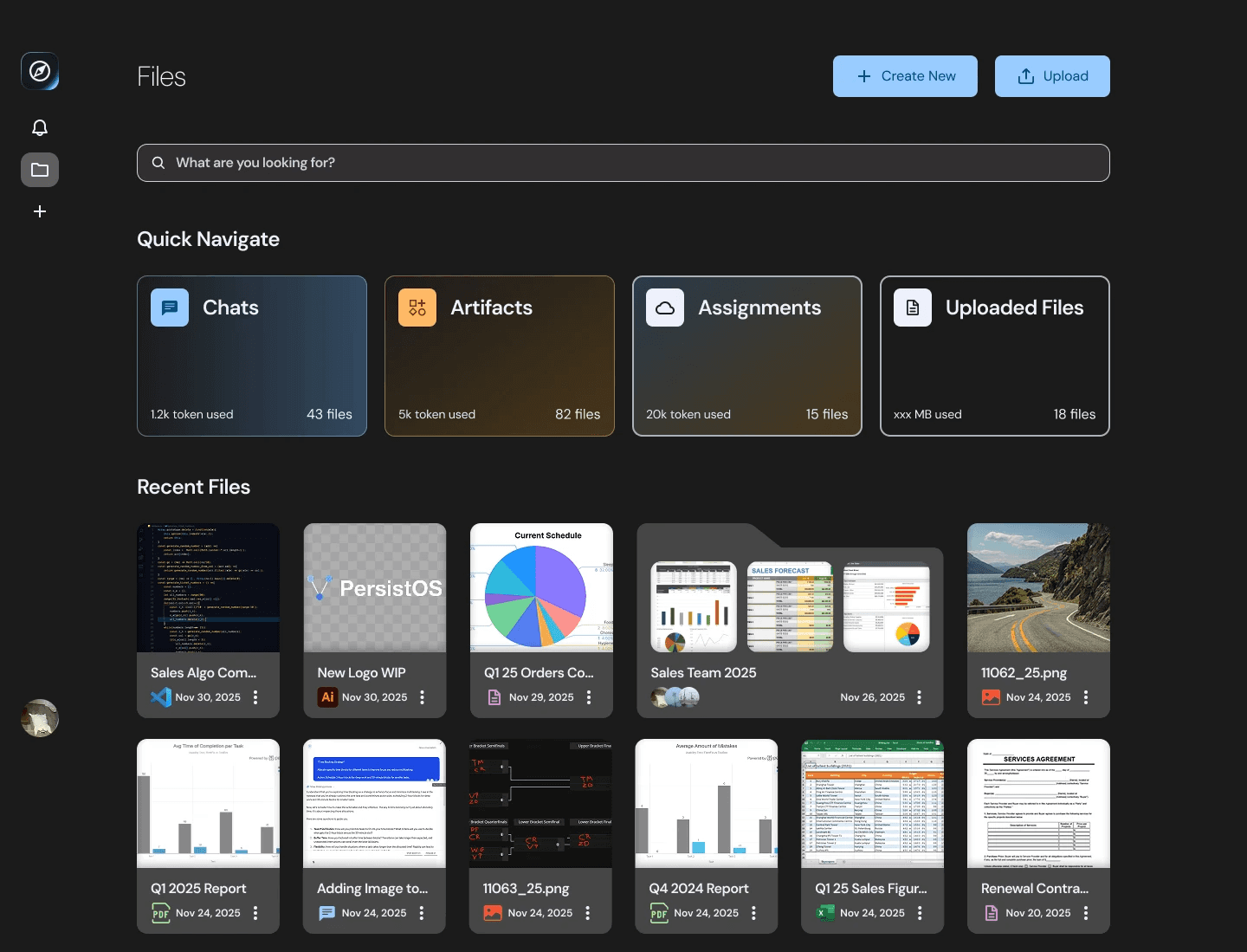
Before

After
This project pushed me across more dimensions than any previous experience. Collaborating closely with engineers, leading a team through the full UX process, and navigating the fast pace of an AI startup was demanding in the best way.
Understanding the technical constraints shaping our available decisions and positioning ourselves in the market was rewarding and enjoyable. I’m grateful to the amazing teammates I collaborated with on this product, and can’t wait to apply what I’ve learned in the future.